Coverity, a market-leading and one of the most powerful Static Application Security Testing (SAST) tools, found the market wasn’t taking its optional user interface, Coverity Connect. The vague stakeholder complaint that Connect “didn’t look modern” was masking urgent business and organizational challenges.
Role: I was hired as the first designer for this 15-year-old product originally designed for developers by developers.
Constraint: As this was a B2B product in Cybersecurity, I could only gain limited access to customers.
Scope: Diagnose why customers keep complaining to sales that the product doesn’t look modern.
Background
Business Impact
The interface problems were driving significant business loss which I would discover through the research:
- 20% Annual Customer Churn: Attributed to users who couldn’t learn and understand the product.
- Lost Competitive Deals: Occurred when prospects compared Connect to newer competitors.
- 1–1.5 Year Learning Curve: Even with training, the interface was considered “scary” to junior developers.
- Compliance Risk: Upcoming European Accessibility Act (EAA) compliance risked excluding the company from government contracts and European markets.
The organizational challenges included skeptical developers, burned-out sales teams, and fearful subject matter experts (SMEs).
Organizational Frustrations
As the first dedicated UX designer, there were people problems to overcome caused by the design.
Developers
Fear
Saw UX designers as UI designers and people that will just suggest ways to polish.
Desire
Improve workflow and performance problems. Also interested in shipping better features.
Sellers
Frustration
Have been requesting usability fixes for so long that they were burnt out from asking.
Desire
Changes made to product to address the pain points that are blocking their sales.
Subject Matter Experts
Fear
The ease of use fixes will too simplify the product and decrease its capabilities
Desire
Increased ease of managing the complexity in the system, so results come faster.
Research & Pivotal Synthesis
My goal was to build credibility with each group through quickly getting a strong understanding of the product.
As a former developer, I began doing a self-proxy test to give basic familiarity.
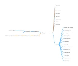
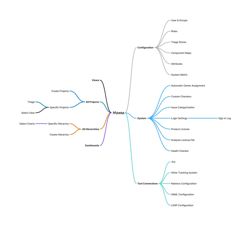
I watched the training videos and conducted a heuristic evaluation while trying to use a demo version of the product, with real details. Through this I was able to learn the site map and get a limited understanding.
The nature of this product, being designed for developers, meant there was vocabulary and terms that didn’t make sense. It lacked intuitiveness to such an extent that it was tough to document or make suggestions.
Because I needed more explanation to understand what I was looking at, I consulted with SMEs.
This proved useful in learning concepts like how hierarchies worked, finding hidden features, and hearing problems that came with longevity, such as permissions with views. They also expressed their clear concern about ease of use.

- The ability to create a type of view that could be applied to all projects, but this created a “primary navigation” that required going to a secondary level to access
- One can see how variables were defined and used, but the width of the link is the width of the variable. Very hard to click when the variable is “i”
- Ability to see history of looking at an issue, but was unmarked
- Ability to jump to next errors, if one notices the lines and knows to click on them

However, they were resistant to change. They didn’t understand the need to create more space for administrative work, despite how cramped the working space was.
They gave me the knowledge that I could finish with heuristic analysis. I could understand non-invasive steps to improve workflows.
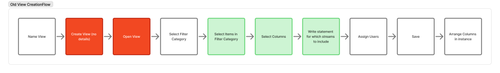
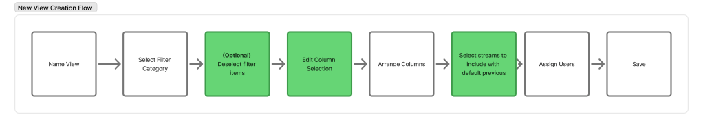
Before and After Views Flow
However, to understand appetite for changes, instead of just improvements, I needed to talk to customers.
When customers were not interested in doing the interviews, I turned to sales as proxy customers.
Sales at first was hesitant to talk as the problems were too many.
“The problems in the UI are pretty obvious, and if you can’t see them yourselves, we don’t have faith that UX can make the needed changes.
Once I showed sympathy to the challenges of sales, and looking for insights to prioritize, they identified that not all personas were acknowledged and set up was a large problem. Administrators needed more attention, and we neeeded to reduce clicks. They believed we needed to maintain the flexibility but improve the workflows. They also started inviting me to more meetings with customers, where I was able to further support accessibility, as EU clients were looking to leave.
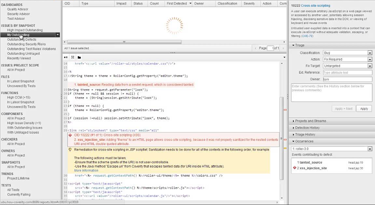
After synthesizing insights from my research, SME perspectives, and customer feedback, I conducted an accessibility audit that revealed significant room for improvement regarding compliance and performance. The primary issue was a reliance on generic div tags rather than semantic HTML. By framing this ‘tech debt’ in terms of reduced performance and slower feature deployment, I was able to provide programmatic solutions to these issues. This approach earned the trust of the development team and demonstrated a deep understanding of their challenges, while also providing the technical foundation needed to lead productive compliance conversations with customers.

- Navigation that with primary role of navigation, which won’t navigate away from the issue
- “Edit” button which effects ALL projects not just the current page
- Name of view in so low color contrast, people miss it
- The table is made of <div> not <table>
- Table data color contrast is too low when information has not explicitly been defined
- Interaction that isn’t labeled not understandable in context
- Links that are too small to easily click on
- Icon for opening the folder tree is not clear or defined
- Icon for formatting how the code is displayed undefined
This work led me gaining the credibility to be invited into a two-day meeting with a VIP customer. During this meeting it revealed that the features were often not meeting their mental models, even closely. Junior developers weren’t using the features as expected, the iconography was confusing and out-of-date and the UI was too noisy.
“We show junior developers this UI and scare them about designs used to look.” CTO describing developer experience
“Is use cases a way that we can talk to you about features. Does this model make sense”
CTO describing a feature that PM and developers designed.
Through all this research, it revealed that the core problem was that in developers designing for developers they were granted more flexibility and freedom than was optimal. Roles and permissions needed to be further defined so the developer experience could be optimized and clearer.
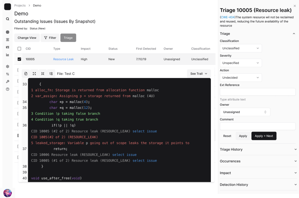
I mocked up what a triage page could look like and got validation from SMEs and sales that it could work
Results and Organizational Change Set in Motion
In four months, I transformed the conversation and secured alignment across 16 stakeholders. I created the cultural change that would permit the UX work to be accomplished.
Four High-Impact Initiatives
- Code Quality & Accessibility Foundation: Addressing non-semantic HTML and accessibility gaps to unlock government sales and European market access, creating a strategic competitive advantage.
- Dedicated Administrator Space: Creating full pages for admin workflows (instead of undersized modals) to improve discoverability, efficiency, and address poor first impressions for new customer acquisition.
- Bulk Actions for Speed and Accuracy: Implementing bulk operations to dramatically improve efficiency in time-critical security scenarios, reducing errors.
- Clearer Status and Guidance for Developers: Making configuration and status visible (e.g., view settings) to prevent errors and aid discoverability while maintaining power.
Concrete Achievements
- Strategic Alignment: The conversation shifted from “make it look pretty” to “fix the workflows and accessibility gaps”.
- Seat At The Table: While conducting this research I was able to help with new features, including a policy feature run through command line. Through my approach to handling the complexity the customer said “We love Phoenix.
- Resource Secured: The first dedicated frontend engineer was assigned to Coverity with the roadmap in hand.
- Trust Established: Built trust with skeptical developers by demonstrating UX could solve workflow and performance problems.
- Process Creation: Established UX documentation practices for a product that never had them in 15 years.
Lessons Learned
- In Enterprise products, it doesn’t look modern is symptom and polishing is not the solution.
- Steakholders resistance is learned and can be unlearned
- Build credibility to earn a space at the table
- Talk about UX value in the stakeholders language
- Simplify managing complexity instead of just simplify
