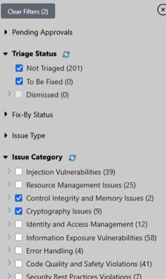
Overview
Background
Software Integrity Group, formerly part of Synopsys, was a leader in cybersecurity tools with a catalog formed through acquisitions. Each product was top-of-the-line, but each had its own unique look.
Project Summary
Starting with the goal to align one product to the standard, I established a design system to define UX standards and improve the team’s maturity.
Responsibilities
- Unify product design languages to enable bundled product marketing
- Create and govern design system across 7 designers and multiple products
- Lead tool migration from Sketch to Figma with training and adoption strategy
- Establish accessibility standards and ensure WCAG compliance
- Build cross-functional partnerships with Engineering, Product, and Leadership
Team
I was the Design System Manager on a UX team with 7 UX Designers
Problem
Top-tier products looked too different to sell together.
Despite consistently being recognized by Gartner for Ability to Execute and Completeness of Vision, Software Integrity Group couldn’t capitalize on integrated product sales. While competitors achieved ~ 70% adoption of bundled solutions, only ~ 30% of our customers purchased integrated products.
The challenges in bundling caused a significant revenue gap and primarily came from the visual inconsistencies. The on-premise platform (Code Dx) and cloud flagship platform (Polaris) looked so dissimilar that bundling them appeared jarring. Customers perceived them as disconnected tools rather than an integrated platform, undermining our market positioning against competitors offering unified solutions. And the testing tools were also equally inconsistent.

This inconsistency had deep roots:
- Products came from different acquisitions, each with its own design language and interaction patterns. Customers had to learn new navigation and behaviors for each tool in the catalog.
- The organization historically hadn’t invested in UX standards. Without clear guidelines or stable design leadership:
- Product Managers created their own designs, bypassing UX
- Developers made ad hoc component decisions for every feature
- High turnover in UX leadership prevented any lasting standards
- UX Designers were slow to deliver wireframes.
The slowness emboldened other departments to make their own design choices, and prevented aligning the team to work on common features between tools.
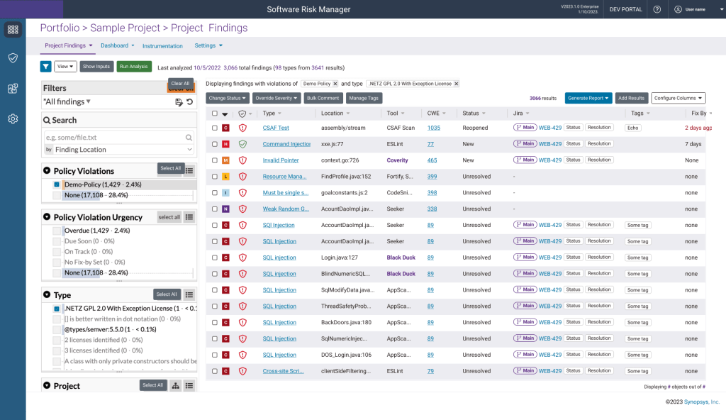
My initial mandate was to rebrand Code Dx into Software Risk Manager and align it with Polaris in 8 weeks.
“Not only are the products not aligned with each other, but none are consistent throughout.”
Dave F – UX Designer
Result Highlights
UX Department gained a stronger reputation for consistently delivering at a higher level. Product managers referred to the team as a “Small but mighty crew”. Some of the results included:
The products were unified, enabling them to be presented and sold as bundles
More DRY Code. 80% decrease in ad hoc component/behavior requests
Higher quality designs made 6 weeks faster
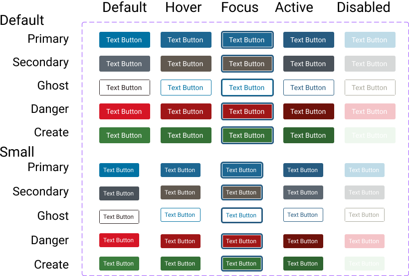
Creating The Design System
I recreated components in Figma instead of repairing in Sketch to save valuable time
I began trying to rebrand Code Dx using the symbols that existed in Sketch, but found several issues in the component library. Because each team member was able to use whichever tool they preferred, and I was much more proficient in Figma, I chose to recreate the library there, resolving broken elements, focusing on each element independently.
Collaborated with the flagship product UI lead to ensure alignment
Updated colors to stay consistent with intent
Contrast met WCAG compliance
All states were represented
Updated focus state to increase visibility
Radio button and checkbox margins were no longer dependent on their label size
I edited the individual components to promote functionality and cohesiveness
To improve component relationships, I changed the base size from 14px to 16px, allowing for fractional ems. I also applied padding more uniformly
| Size in Ems | 14px base | 16 px base | Example Use | Problem |
| 2em | 28px | 32px | Space between paragraphs | |
| 1 em | 14px | 16px | Text | |
| 0.5em | 7px | 8px | Padding in textbox | |
| 0.25em | 3.5px | 4px | Space between checkbox and label | Fractional px don’t exist; including them leads to blurring or elements being adjusted |
Working with the Design team to understand intent, I conducted an icon audit and a color audit. And found a lot of inconsistencies in usages.
Existing Style Guide

Each add icon was used interchangeably
Needed to use context to explain what icon did
No accessibility consideration, such as alt text or ARIA labels, on any icons.
New Design System

Icon used for icon button to add another unit
Aria used to explain button use

Used decoratively to enhance the ‘Read More’ button. Empty alt-text was used to ignore it
Example of inconsistent use..
With the components made, I found best practices for collaborating with cross-functional teams in Figma
I tested how well Figma could contribute to communication between UX, Developers, and Product Managers by rebranding Code Dx into Software Risk Manager. Being able to do an asynchronous review and be assured that everyone was talking about the same version was a great benefit for our ways of working. It allowed us to work when it was convenient.
I defined design tokens to promote consistent use.
While making the frames, I noticed the flagship product had unclear design token names, which led to inconsistencies in how to use colors. This created extreme challenges in contrast. Additionally, in implementation, developers sometimes used the token name and other times the hex value.
Fortunately, Figma had recently released variables, so I could create clear design tokens and prevent future confusion on which colors to use. And give clear guidance on how to use colors.
Sample Colors


Old Style Guide Color Name
Main-Calypso
#275B80
Main-White
#FFFFFF
Main-Whisper
#ECECF1
New Design System
Primary-Background-Button-Default
Primary-Background-Interactive
Blue-500
#275B80
Primary-Background-Page
Primary-Background
White
#FFFFFF
Secondary-Background-Page
Secondary-Background
Grey-500
#ECECF1
Governance
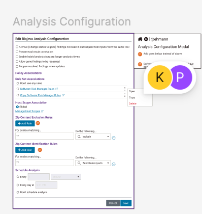
With Figma’s implementation being very successful for one product, my next goal was roll this out to the team, and unite us under one tool.
I conducted weekly Figma trainings to ensure successful migration and change adoption.
The two tools use different workflows, which often leads to teams abandoning the migration in frustration. So, I conducted weekly Figma trainings to ensure successful migration and change adoption.
- Trained entire team through zoom team
- Addressed differences between Sketch and Figma in flow and philosophy to ease adoption
- Conducted follow-up with individual sessions to tailor to individual comprehension
“At first, I was frustrated because I couldn’t use Figma in the same way that Sketch worked, but then I realized Figma was how I preferred Sketch to work”
Brittany- A UX Designer
I addressed the different concerns of the team to ensure adoption.
Initially, I assumed providing Figma components would be enough. But designers are people with real concerns. I needed to address the human element of adoption.
[Persona 1 visual/card] The Stakeholder Partner
- Behavior: Frequently created custom solutions when Product or Engineering requested them
- Root concern: Wanted to be responsive and helpful to cross-functional partners
- My approach: Established clear organizational backing for system standards and coached on constructive pushback strategies
- Outcome: Gained confidence to advocate for system consistency
[Persona 2 visual/card] The Pattern Explorer
- Behavior: Constantly researched new patterns and wanted to try novel approaches
- Root concern: Feared the system would stifle creativity and prevent innovation
- My approach: Created evaluation frameworks for new ideas and explained downstream costs of ad hoc patterns
- Outcome: Channeled creativity into system improvements rather than one-off solutions
[Persona 3 visual/card] The Process Adherent
- Behavior: Comfortable with existing Sketch workflows, hesitant about Figma migration
- Root concern: Change felt disruptive without clear benefit
- My approach: Engaged through design critiques and made them active decision-makers in system evolution
- Outcome: Became invested participants rather than reluctant adopters
By treating my team as design system users with distinct needs, I achieved willing adoption rather than grudging compliance.
To further promote consistency, I negotiated the procurement of ZeroHeight to a single source of truth for Developers and Designers.
- Collaborated with Developers to ensure that the tool would meet Design and Development collaboration needs.
- Interviewed 2 different vendors
- Made 3 pitch decks to explain the need for ZeroHeight to C-suite
To address quality issues, I conducted weekly design critiques and advocated for accessibility, ensuring internationally recognized standards are met.
- Focus on inclusive designs.
- Mentored design team to start thinking in workflow effectiveness over just screens
- Gained buy-in that the users needed clarity and quickness over uniqueness and experimentation
- Worked with designers to prevent ad hoc components
- Negotiated to prevent ad hoc behaviors

Promoted further collaboration between product design teams by preparing documentation pages in ZeroHeight.
- Created pages for each component explaining rules governing usage and accessibility.
- Created pages to explain overall philosophy for topics like disable vs hidden
- Redid Figma variable structure to meet requirements for ZeroHeight upload
Detailed Results
Implementing the design system and establishing standards helped several stakeholders that were seeking their various goals.
UX Designers
With a design system that allowed designers to deliver better quality designs 6 weeks faster, they had sole ownership of design
Engineers
With 80% less requests for ad hoc components/ behaviors, the engineers had more time to develop features
Customers
Customers began complimenting the designs based on improved ease of use
Product Managers
With more comfort in giving ownership of designs to Designers, they had more time for meeting with customers and forming requirements for new features
Finance
This process changed the organization from each designer using their own tools to unifying on Figma, reducing the number of licenses from 3 to 1.
Sales
The catalog of products demoed better, which led to more customers interested in the product and Software Risk Manager in Top 20 Hottest Products at Black Hat 2023
Marketing
The catalog of products were more unified, allowing for the products to be presented in bundles.
Legal
The design system components had accessibility baked in, resulting in 20% improvement in WCAG compliance
Lesson Learned
When Design Systems are approached through social skills instead of just technical there is more success.
- Take time to ensure that designers know the names and usage of components; it will not always be obvious.
- Align values in using a design system, resistance to implementing came through focusing too much on clarity from those who valued aesthetics, obedience to authorities in other departments, or, hesitancy to change.
- Change management works better when training is prioritized. Thanks to several weeks of training, the migration was successful and complaint-free
- Increasing a department’s standards will translate into better cross-functional collaboration and more credibility.
 Phoenix Ehmann Product and Service Designer