Background
Project Summary
Coverity was a 15-year-old tool originally designed for developers by developers. While Coverity could run via command line, Connect was the user interface, and although Coverity was loved for its capabilities, Connect was heavily criticized for its user experience. Because the interface was optional, UX improvements had historically been deprioritized. As the first dedicated UX designer for this tool, I was tasked with learning what was meant when customers said “it didn’t look modern” and creating a roadmap for modernizing. To do all this, I needed to establish how UX would work with the existing teams.
Team
I was the first and only UX Designer for this product. There were also 3 product managers and 12 developers already working on the product. I also collaborated with 10 members of the sales team.
Responsibilities
- Strategy and Planning: Developed 4-month modernization roadmap from low-hanging fruit to substantial redesign
- Stakeholder Management: Built alignment across 15+ stakeholders including engineering, product, and sales teams
- User Research: Conducted heuristic analysis, accessibility audit, competitive analysis, and sales team interviews when direct user access was unavailablePrototyping:
- Created workflow improvements and interface mockups to test modernization concepts
- Documentation: Established first UX documentation practices for product
Problem
Top SAST tool losing sales due to outdated UX
It doesn’t look modern and if it doesn’t look modern then it not modern to potential customers
Jimmy Product Manager
Behind the often stated issue of “doesn’t look modern” lay several issues that competitors were exploiting. Despite being a market leader in static analysis functionality, Coverity Connect was losing competitive deals and risking contract renewals. Sales teams reported that customers found the interface ‘scary’ to junior developers, with a 1-1.5 year learning curve even with training. But this vague complaint masked deeper issues: inefficient workflows, poor accessibility ahead of the European Accessibility Act (EAA) compliance deadline, and confusion around core security features. With no dedicated UX designer in 15 years, the optional interface had been deprioritized, and there wasn’t the research to know where to start fixing it.
Results
A cultural change in looking at the state of Coverity Connect along with a roadmap on how to increase sales and contract renewals.
- Transformed the concept of modernization from cosmetic to performance
- Turned frustrated sales teams into strong allies.
- 15 People united for a common view of modernizing Coverity
- 1st Dedicated frontend developer assigned to Coverity
- 7 Internal partnerships formed
- 3 External design partnerships formed
Duration
In 4 months, I went from no experience in the product to launching a strategy for addressing modernization through developing partnerships to increase my understanding.
Research
I began with hands-on discovery to establish credibility
I began by trying to learn the product independently. I created a site map of the current state and conducted a heuristic analysis of the product to test intuitiveness and establish my credibility in future meetings.

Because I had previous developer experience, I could approach this as a typical user to assess the product’s intuitiveness. When I got lost, I tried watching the training videos. From doing this, I learned the usability issues: unusual vocabulary, hidden features, and non-linear navigation
After realizing that Coverity Connect’s design favored customization at the expense of intuitiveness, I reached out to Subject Matter Experts to understand how users navigated and configured the tool in practice.
When self-exploration hit dead ends, I consulted experts
After realizing that Coverity Connect’s design favored customization at the expense of intuitiveness, I reached out to Subject Matter Experts to understand how users navigated and configured the tool in practice. Through this, I discovered new features, but also additional opportunities. Also, there was a large concern that increasing ease of use would take away crucial capabilities, as has been done with other products.

- The ability to create a type of view that could be applied to all projects, but this created a “primary navigation” that required going to a secondary level to access
- One can see how variables were defined and used, but the width of the link is the width of the variable. Very hard to click when the variable is “i”
- Ability to see history of looking at an issue, but was unmarked
- Ability to jump to next errors, if one notices the lines and knows to click on them
I conducted accessibility audits that revealed interface, performance, and compliance issues weakening our competitiveness
With the greater understanding of Coverity and aware that the EAA was coming soon, I conducted an accessibility audit. Using the audit, sales feedback, and competitive analysis, it became clear that users found our interface unintuitive and visually dated, and the DOM less performant than it should be.

- Navigation that with primary role of navigation, which won’t navigate away from the issue
- “Edit” button which effects ALL projects not just the current page
- Name of view in so low color contrast, people miss it
- The table is made of <div> not <table>
- Table data color contrast is too low when information has not explicitly been defined
- Interaction that isn’t labeled not understandable in context
- Links that are too small to easily click on
- Icon for opening the folder tree is not clear or defined
- Icon for formatting how the code is displayed undefined
I also conducted a competitive accessibility audit of GitHub and Snyk’s similar features. This gave me the strategic ammunition I needed: with legal requirements for government contracts and the European market facing EAA compliance, I could demonstrate that improving accessibility was both a competitive advantage and a business necessity.
My customer recruitment attempts unexpectedly built strategic partnerships
After forming a strong understanding of the issues from my perspective. I tried recruiting active users to interview them on their experience with the product. Unfortunately, despite 3 attempts to recruit, no current users responded. However, my attempts to recruit current users for feedback evolved into building partnerships that informed future design collaboration
0 interest in interviews to talk about current experience
6 immediate invitations to strategy meetings to talk about future directions and
3 external design partnerships formed to discuss and test new designs
I turned frustrated sales teams into allies who served as customer proxies
Therefore, I turned to the sales teams to be the voice of the customers and explain what issues were being reported. This was met with initial resistance and frustrations from years of having the requests to modernize being ignored. I diplomatically turned this frustration into an allyship, as we were united on the same goal to increase sales. This revealed several large issues that had not been socialized yet.
While most product managers thought modernization was just about appearance, this would ignore real modernization needs, and could only possibly help pre-sales
The largest complaint was the clunkiness of workflows. The technical design was inefficient and took too much time to do simple administrative tasks
There was a very steep learning curve. According to the technical sales account maangers, It would take customers 1 – 1.5 years to learn and be comfortable with it, even with help

Customers highly valued the ability to customize. And there was a fear that simplification would reduce power.

Many ignored personas, as the only one addressed was the Developer. Administrator experience was very hard
Strong alliances granted access to a two-day customer strategy meeting
Through making connections with sales and product management, I was invited to a two-day meeting with one of the current customers to discuss future directions. Through doing so it was clear how much of a mismatch the product was to their expectations.
“We show Junior Developers this to scare them about how websites used to look“
CTO Customer
- Junior developers were the main developers using the product.
- Junior developers did not understand the icons that were being used, and therefore weren’t using features that could benefit them.
- Screens were too noisy, which slowed down developer’s ability to quickly triage issues.
“Does Product understand user stories as a way of communicating?”
- The client didn’t understand some core functionality, resulting in critical information regarding current security risk being misunderstood.
- While product management and engineers thought a new feature would address their concern, it was ineffectual to the current need.
Synthesis
The research revealed that initial assumptions were wrong. A purely cosmetic approach would at most help pre-sales, but wouldn’t solve the workflow and learnability issues that were losing deals and frustrating customers. Oversimplifying to improve ease of use would eliminate the customization capabilities power users valued, alienating the existing customer base.
Instead, building credibility with frustrated sales teams and skeptical customers required solving real workflow problems while preserving power. I identified four high-impact initiatives:
- Code quality
No design system, non-semantic HTML, and accessibility gaps weren’t just usability issues. They were blocking government sales, but addressing them proactively could create a strategic advantage. This foundation would enable all future improvements. - Dedicated admin space
Admins, often first users at new accounts, faced buried workflows in undersized modals. This created poor first impressions and lost sales when prospects couldn’t find features. - Bulk actions for accuracy and speed
One-at-a-time workflows contradicted cybersecurity’s need for speed. Bulk operations would dramatically improve efficiency for time-critical work. - Clearer status and guidance for developers
Connect’s power relied on remembering complex configurations and structures. Hidden status could cause critical failures, like issues being detected but not displayed due to view settings from another project.
Design
Given the devoted customer base, and the steep learning curve, my aim was to find impactful changes that didn’t add confusion or relearning.
I steamlined workflows to increase speed through decreasing need for clicks
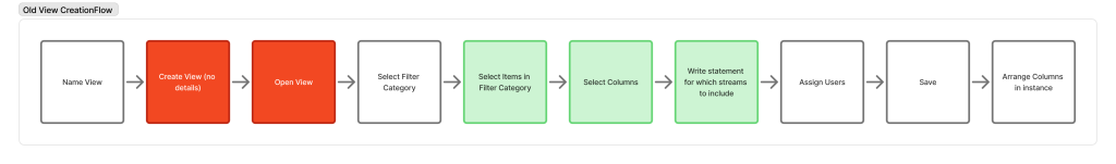
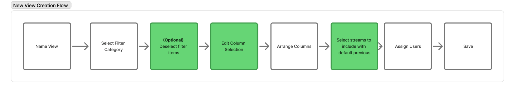
I looked at the workflows to see how I could simplify. In just the creating view, I suggested how to remove unnecessary steps, and then streamline current logic.
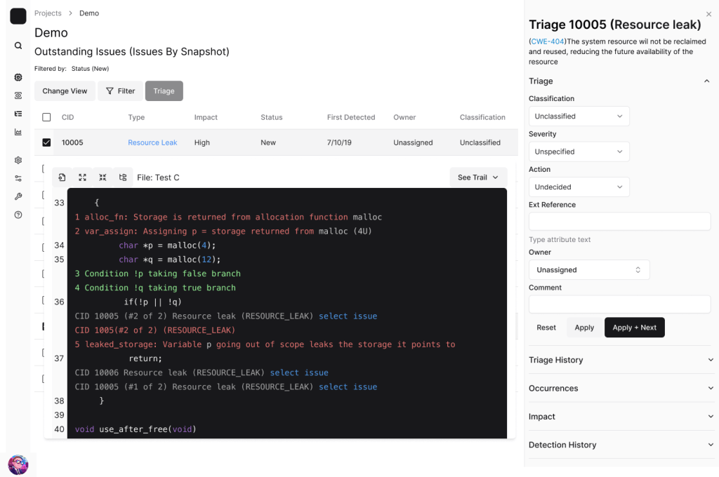
I updated the UI to be clearer for developers
I also experimented with new designs to show how issues could be updated for more clarity. In addition to making all information in categories readable, this design:
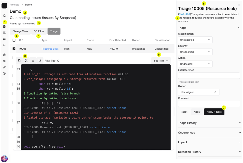
- Side navigation to make more of the product easier to find
- Clearer hierarchy
- Easier to see what filters are in effect
- Easier to find ability to change views
- Ability to edit the current view, but have it only affect the current instance
- More clarity through clearer icons or labels
- Happy path highlighted
- Easy recall for which issue is being triaged
- Additional attention on link to learn more about the vulnerability
I changed the Information Architecture to provide dedicated admin space
I suggested an improved information architecture would create full pages for admins to work but it would also:
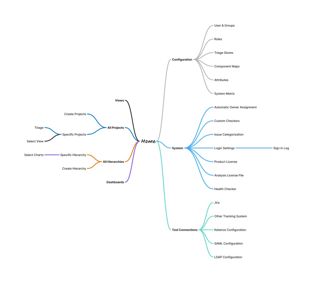
- Put Projects, Views, Dashboards, and Hierarchies on the same level to add clarity and easier to find where to create views
- Using views would be under projects
- Break out configurations for a huge cluster to grouped by purpose
- Create and maintain different entities in the tool
- System changes, like licensing
- Manage 3rd party tools
To strengthen relationships I tested acceptance with Sales teams
Then I tested these ideas with the sales team. It revealed that I was still being too conservative with the old design. Because even current customers were highly confused with the product, there wasn’t the normal cost for relearning how to use the product.
“Great start, but continue looking to reduce clicks. Clicks are bad.”
Scott – sales specialist representing government contracts
After this testing, I was ready to deliver the roadmap for improvement. Leveraging strong internal partnerships, I secured buy-in from engineering and product teams, laying the groundwork for a holistic redesign process aligned with the newly-developed UX maturity goals.
I created the Roadmap prioritizing small wins to show progress
From all the interviews and testing, I was able to create the roadmap, going from low-hanging fruit to more substantial projects.
- Minor accessibility updates to show direction
- Create Design System with clearer iconography
- Update Information Architecture
- Create pages for administrative actions
- Update copy to explain tool specific vocab
- Build bulk actions
- Increase efficiency in individual actions, using AI where appropriate
Results
Through this project, I was able to gain greater clarity into the modernization complaint that was steering customers away from the product, and in doing so set the product up for continued success.

Transformed modernization from dismissible purely aesthetic issue to one of technical capabilities

Turned 3 frustrated sales teams into strong allies, opening new channels of information about customers current and future concerns

3 customers showing increased satisfaction as they saw features fitting use cases. One declared, “We Love Phoenix”, in response to my recommendations

Investment in the first dedicated Front-End engineer to accomplish the tasks.

16 people between product, quality, design and engineering aligned on the vision and need of modernization.

3 new external design partnerships with UX, so new features could be prototyped and tested.
Lessons Learned
This work highlighted some important lessons
- The initial claim, It doesn’t look “modern”, led to thinking about aesthetics, but that path was not of interest to sales, engineering, or customers. Capabilities matter.
- Visualization does matter, however, as outdated or odd icons will not communicate, and visualization does help presales.
- The key to building strong relationships was understanding how UX would benefit the individual party (e.g. easier sales, clarifying user stories, faster development). Even in places that have historically undervalued UX will value what UX can do for them.
- Sales teams are a wealth of information about what customers want
