Executive Summary
Business Challenge: ReMatter, a startup in the scrap metal recycling industry, faced a dual problem: their desktop application had usability issues, and the industry accepted 8-16 hours of daily double data entry (paper → digital) as normal. Desktop-only tools couldn’t be used in the field, forcing operational delays, inventory errors, and compliance shortcuts.
My Approach: Led 3-week mobile design sprint using creative research methods (no direct customer access allowed), service blueprinting to map complex workflows, and proxy testing through trained COO to validate designs with real facilities.
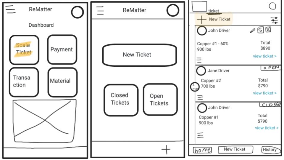
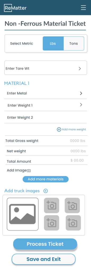
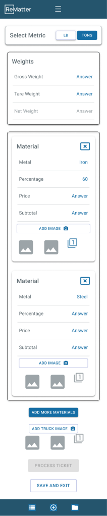
Solution: Mobile-first workflow that enabled real-time data entry at point of work, eliminating paper → digital transcription. Designed for operational context (ferrous vs. nonferrous materials, public vs. commercial customers, multiple tare scenarios) rather than aesthetic trends.
Impact:
- 8-16 hours per day saved per facility (eliminated walking between scale/office and double data entry and using optimized workflows)
- $200K annual savings per facility (labor cost reduction + error elimination)
- $1M additional funding raised (mobile success demonstrated market differentiation)
- Established mobile UI patterns for all future features
- ReMatter became industry leader (first mobile-optimized solution in scrap recycling)
Skills Demonstrated: Service Design Strategy, Workflow Optimization, Research Under Constraints, Service Blueprinting, Proxy Testing Strategy, Stakeholder Training, Cross-Functional Alignment, Mobile UX Patterns
Background
Company
ReMatter is a startup company that started during the Covid shutdown. They had launched their first product less than a year before I joined for a sprint as part of my General Assembly program. Their focus was on creating software for scrap metal recycling. They wanted to differentiate themselves from the market by focusing on ease of use, which included making mobile options.
Project
The goal of this project was to:
- Learn the ecosystem for how the mobile tool would be used
- Create the design for the scale ticket feature
- Create a design system foundation for all future features
Constraints:
- 3-week timeline (research → design → validation)
- No direct customer access (Covid-19 precautions)
- No existing mobile solution
- Desktop application already criticized for poor usability
Team
- Service Design Lead (Me)
- 2 UI Designers
- Subject Matter Expert (the COO)
My Responsibilities
- Lead service designer for 3-week mobile product sprint
- Domain research and competitive analysis under access constraints
- Service blueprint development and workflow design
- User testing strategy and stakeholder training (COO)
- Cross-functional alignment (COO, UI team, engineering)
- Context-aware mobile workflow pattern creation
Problem
Industry Accepted 8-16 Hours of Daily Waste as Normal
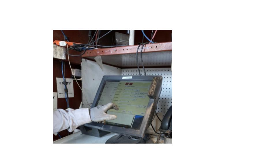
ReMatter faced a dual challenge: their desktop application was already criticized for poor usability, and they were entering an industry where 8-16 hours of daily double data entry was accepted as normal.
The systemic problem:
- Desktop-only tools couldn’t be used in the field
- Operators wrote information on paper at the scale
- Walked to office to transcribe paper → digital
- This caused:
- Inventory errors (illegible handwriting)
- Compliance shortcuts (operators skipped steps under time pressure)
- Operational delays (waiting for data entry)
The strategic opportunity: Mobile could differentiate ReMatter in a technology-overlooked industry—but they had nothing built yet, no design system, and needed to establish a reputation for ease of use that contradicted their desktop legacy.
We had 3 weeks to prove it could work.
Research
Week 1: Building Domain Expertise Without Customer Access
I conducted desktop research to gain domain understanding, revealing that the market was sacrificing compliance for speed
Facing client restrictions on direct user research, I designed a secondary research strategy to quickly build domain expertise in the scrap recycling industry. I systematically analyzed:
- YouTube content from facility operators showing actual workflows
- Scrapper pictures videos demonstrating how materials are brought to facilities
- Competitor tool demonstrations showing current market solutions
Critical insight discovered: Facilities were sacrificing legal compliance and accuracy for operational speed because existing tools couldn’t support both simultaneously. Additionally, facilities dealt with fraud attempts from bad actors trying to inflate recycling weights, requiring careful verification processes.
By conducting a heuristic analysis and testing a demo version, I learned that desktop patterns couldn’t translate to mobile
To understand the gap between the existing desktop solution and mobile needs, I conducted a heuristic evaluation of the current tool using realistic use cases, comparing the system against field photos of operators’ actual workflows.
This analysis revealed a fundamental service design flaw:
❌ The product created double data entry
- Paper tickets at scale → manual transcription into desktop system
- 8-16 hours per day per facility spent on this process
❌ Used desktop-optimized tables unsuitable for mobile
- Complex multi-column layouts
- Required mouse interaction patterns
- Unreadable on small screens
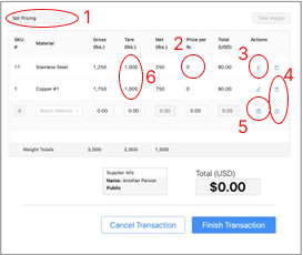
✅ But: Had developed effective table-based input pattern
- Users had adapted to desktop workflows
- Pattern could be translated to mobile with modifications
⚠️ Critical discovery: The desktop’s complex flows directly contradicted the C-suite’s stated goal of user-friendliness, signaling a misalignment between vision and execution that would need to be addressed to make mobile successful.
Week 2: Service Blueprinting & Workflow Design
I worked with the COO to create more defined workflows and shifted away from the desktop’s “black box” model
Recognizing that the existing “black box” model was causing errors and would compound on mobile, I shifted the approach to workflow-based design that would guide users down correct paths based on context.
My collaboration process with COO:
- Mapped complete service flows for all ticket types
- Uncovered critical operational nuances:
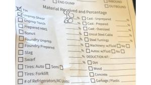
- Ferrous vs. nonferrous distinctions (different weighing methods)
- Dispatch protocols (how materials are routed)
- Differential handling of public vs. commercial scrappers
- Multiple tare scenarios (vehicles with different load configurations)
The breakthrough: Our initial assumption—the simple weigh-in → unload → weigh-out model—represented only one of multiple pathways. Forcing all transactions into that pattern would actually slow operations rather than improve them.

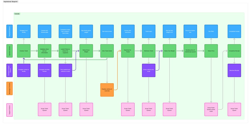
Service blueprint outcomes:
- Documented complex variations in ticketing workflows
- Secured executive buy-in by demonstrating deep understanding of operational realities
- Revealed that flexibility within structure would be key to success
I conducted co-working session with UI designers to communicate the requirements for the UI
To translate complex service blueprints into actionable designs within sprint constraints, I facilitated a collaborative working session with the UI team using FigJam to explore how workflows would manifest in mobile interfaces.
My facilitation approach:
- Walked through operational nuances while co-designing in real-time
- Guided strategic prioritization by balancing scope against testing timeline
- Led team to focus on highest-impact distinctions:
- Public vs. commercial customers
- Nonferrous vs. ferrous materials
Why this worked: By enabling designers to understand operational context while making design decisions, they could honor service complexity without overwhelming the MVP. This collaborative prioritization ensured we could deliver testable designs within the sprint while establishing patterns that could scale to additional workflow variations in future iterations.
Week 3: Proxy Testing & Validation
I designed a proxy testing strategy that validated our designs with real clients through COO-facilitated sessions
Facing continued customer access constraints, I designed a pragmatic validation strategy using the COO as a domain expert proxy while simultaneously building the organization’s research capabilities.
What I created:
- Structured usability test scripts for both ferrous and nonferrous workflows
- Training session with COO on:
- Remote facilitation techniques
- Observation practices
- How to probe for usability issues without leading participants
- Zoom-based testing protocol with screen recording
- Documentation process for session review
Dual purpose achieved:
- Validated mobile designs with 2 actual facilities
- Established repeatable research practice the COO could continue independently
Impact beyond the sprint: By teaching research methods and creating documentation processes rather than just gathering feedback, I enabled the organization to maintain user-centricity beyond this project despite access limitations.
Through viewing the videos, I learned the basics of the design exceeded expectations, but there were still important details to fix
“This is great. It will make sure we have accurate inventories.”
— Facility Operator (Tester)
I reviewed the recorded Zoom sessions to evaluate design intuitiveness and operational viability, analyzing think-aloud commentary while accounting for testing limitations (Figma prototype environment without real operational pressure).
Core validation: Both facilities expressed enthusiasm about the potential for speed and accuracy improvements they considered “game-changing.”
However, analysis revealed three critical flaws in our service model assumptions:
⚠️ Ferrous vs. nonferrous distinction incomplete
- Our model: Ferrous = % of load; Nonferrous = pounds
- Reality: Public scrappers with small mixed loads didn’t fit this pattern
- Fix needed: More flexible material classification
⚠️ Tare weight assumptions wrong
- Our model: Nonferrous materials can always access tare weight first
- Reality: This wasn’t operationally true in all scenarios
- Fix needed: Conditional tare workflows
⚠️ Vehicle weight consistency assumed
- Our model: Consistent tare weights per vehicle
- Reality: Multiple loads required different tare calculations
- Fix needed: Support for variable tare scenarios
The value of user-guided design: These insights required immediate design pivots. Our proxy testing approach prevented us from shipping a solution that would have failed in real operational contexts.
I presented research findings to UI to update mockups
I synthesized test findings into actionable design implications and facilitated working sessions with the UI team to collaboratively solve the newly identified service model gaps.
My approach:
- Framed insights as opportunities to strengthen MVP viability (not failures)
- Used direct video quotes to ground discussions in user reality
- Co-designed solutions that balanced flexibility with implementation feasibility
- Maintained collaborative problem-solving approach
Why this mattered: By showing respect for the design work already invested, I enabled the team to embrace significant late-stage changes as improvements rather than setbacks.
The revised designs incorporated:
- Conditional workflows adapting to operational context:
- Customer type (public vs. commercial)
- Material mix (pure vs. mixed loads)
- Tare availability (pre-weighed vs. calculated)
- Preserved intuitive interaction patterns users responded to positively
- Maintained core efficiency gains while adding necessary flexibility
Cross-Functional Alignment
I led the presentation of finished design to engineering and negotiated the strategy of “efficient over stylized”
To ensure technical feasibility and build engineering buy-in, I facilitated a comprehensive design review presenting the mobile solution and the strategic rationale behind our workflow-driven approach.
Engineering’s reaction:
“This is too boring. Can’t we make it look more like DoorDash?”
Engineering wanted visual flair. I needed to help them understand why operational speed demanded visual restraint.
My response:
“You’re right. This isn’t visually exciting. That’s intentional. Operators process 50+ tickets per day under time pressure, often in harsh conditions: sun glare, wearing gloves, distracted by trucks backing up. Every unnecessary visual element is cognitive load.
DoorDash optimizes for delight in casual consumer scenarios. We’re optimizing for speed and accuracy in high-stakes operational contexts where errors cost thousands of dollars.
‘Boring’ means frictionless. That’s not lack of ambition—it’s strategic restraint.”
The shift:
- Before: Engineering saw “lack of ambition”
- After: Engineering understood “strategic restraint”
- Result: Aligned team around operational context > aesthetic trends
Cross-functional alignment achieved: By reframing aesthetics through the lens of operational context and user goals, we aligned engineering around the principle that interface restraint was a strategic choice. The design was validated as technically feasible and moved to implementation.
Solution: Mobile-First Service Redesign
Service Architecture Transformation
Before (Desktop Model):
- Operator writes truck information on paper at scale → 30 seconds
- Walks to office → 2 minutes
- Manually transcribes paper → desktop system → 3 minutes
- Walks back to yard → 2 minutes
- Repeat 50+ times per day = 6+ hours walking + data entry
- Errors from illegible handwriting = 2-3 hours fixing inventory discrepancies
- Total waste: 8-16 hours per day per facility
After (Mobile Model):
- Operator enters data on mobile device at point of work → 30 seconds
- Data syncs automatically to system
- No walking, no paper, no transcription, no errors
- Time saved: 8-16 hours per day per facility
Workflow Design Principles
1. Context-Aware Pathways
- System adapts to customer type (public vs. commercial)
- Material handling varies by type (ferrous vs. nonferrous)
- Tare weight calculations adjust to scenario
2. Operational Clarity
- Large touch targets (operators often wearing gloves)
- High contrast for outdoor visibility (sun glare)
- Minimal visual noise (focus under pressure)
- Clear status indicators (prevent silent errors)
3. Error Prevention
- Required fields enforced at entry
- Weight validation before completion
- Material classification guidance
- Confirmation steps for high-stakes actions
4. Speed Optimization
- Default values based on context
- Minimal required fields
- One-handed operation possible
- Quick access to common actions
Mobile UI Patterns Established
Reusable components created:
- Context-adaptive forms (adjust fields based on workflow)
- Material type selectors (ferrous/nonferrous with visual guidance)
- Weight entry patterns (tare/gross with validation)
- Customer type toggles (public/commercial with different flows)
- Status indicators (real-time feedback on ticket completion)
Design system foundation:
- Typography system optimized for outdoor readability
- Color palette with high contrast ratios
- Touch target sizing (minimum 44×44px)
- Spacing system for mobile density
- Icon library for material types and actions
Scalability: These patterns could extend to all future features, enabling rapid development while maintaining consistency and usability.
Results: Operational Transformation & Business Growth
Service Delivery Impact
8-16 hours per day eliminated per facility
- Before: Operators spent 6+ hours walking between scale and office to manually transcribe paper tickets into desktop system
- After: Mobile-first workflow enabled real-time data entry at point of work, eliminating paper → digital double-entry
- Additional benefit: Reduced inventory errors from illegible handwriting
$200K annual savings per facility
- Labor cost reduction from eliminated double-entry (8-16 hours × $25-35/hour × 250 working days)
- Error reduction improving inventory accuracy
- Compliance improvements reducing legal risk
- Fraud prevention through immediate verification
Business Impact
📈 $1M additional funding raised
- Mobile success demonstrated market differentiation
- Validated ReMatter’s “ease of use” positioning against competitors
- Proved startup could innovate in technology-overlooked industry
- Enabled expansion to additional facilities and features
🎨 Mobile UI patterns established for all future features
- Created reusable workflow components
- Built design system foundation
- Enabled rapid feature development without starting from scratch
- Consistent user experience across product
🏆 ReMatter became industry leader
- First mobile-optimized solution in scrap recycling market
- Differentiated from competitors stuck on desktop-only tools
- Established reputation for innovation
- Attracted new customers seeking operational efficiency
Organizational Capability Building
👥 Trained COO in user research methods
- Created reusable testing protocols
- Established documentation practices
- Enabled ongoing user-centered development
- Built research capability that outlasted my 3-week engagement
Customer Validation
“This is great. It will make sure we have accurate inventories.”
— Facility Operator
“Game-changing for speed and accuracy.”
— Facility Manager
Facilities confirmed the mobile solution delivered on both promises: faster operations AND improved accuracy—a rare combination in an industry that had resigned itself to choosing one or the other.
Lessons Learned
- Create research methods can compensate for access constraints
- Service blueprinting prevents shipping solutions that fail in operational reality
- Boring design in strategic restraint, not lack of ambition
- Training stakeholders in research methods creates lasting organizational capability
- Proxy testing thrugh domain experts can validate usability when users aren’t available
- Industry-specific context matters more than universal design trends
