Problem: Wants team. But Frankenstiened pages. Ahh Monsters!!
People have stopped using the
People have stopped using the site. It was confusing. Roles were blurred in the site, and mentors, students, nor parents could understand the site structure. Some pages were missing. Some pages were long and not scannable. Emails became the main and often only way used to communicate widespread news. But younger generations are moving away from email.
This loss of information was leading to less involvement and less funding. They even struggled to get runners to apply for the Boston marathon bibs.
Solution: Increase engagement by defining routes.
- Edit content to add clarity to what is expected from everyone on the team
- Identify the different people who would use the site, and give them their needed content.
- Prioritize the students
- Group those who support students separately to make it easier to find those roles
- End the reliance on emails.
Client:
Dreamfar
Project Duration:
2 Weeks
Role:
Solo Project. Conducted research into what users need for the site, and designed the pages
Tools:
Whimsical, Optimal Workshop, Figma, Squarespace
Methods:
Comparative Analysis, Card Sorting, Usability Testing, User Interviews, Site Maps, Personas, Wireframing
Dreamfar is a nonprofit organization in Boston with the goal of training high school students to run a marathon to teach them goal setting and overcoming challenges, It builds community for the students who might be having troubling engaging, increases confidence, and stresses the need for personal care Recently, the founder left the organization, so it was time for a site redesign
.
Who Is At Dreamfar
Through talking to the client, I learned that there could be 8 different types of users. To begin to unravel the confusion, I focused on the three most heavy potential users and created proto-pesonas to act as reminder of what their goals are.
The nervous student who journeys from interested to needed information on the site.

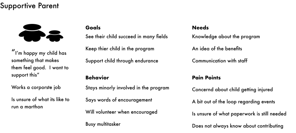
The supportive parent who needs to sign off on the child participating
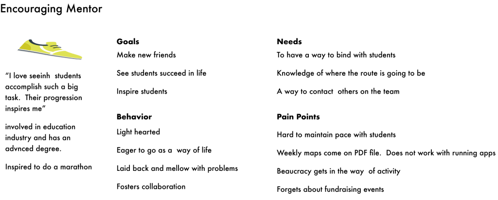
The mentor who chooses to support the students training for the marathon
I identified these three users as the ones that would most often need to receive a global communication. And I assumed that if I could optimize for these groups, it would give other groups (like donors) faith in the credibility of the site.
Not Together From The Start
Because these were the main personas it was even clearer that emails were a bad idea. The organization’s leaders and board members use emails. Student and young mentors don’t. Everything involved an email.

Each step of emailing can go wrong, and lead to unknown service failure. There are better communication tools.
Emails:
- Have addresses that can mistyped
- Easy to lose in overcrowded inboxes
- Do not have confirmation it went to the right source
- Get sent to spam boxes
- Are not a tool of choice by Gen Z or younger
I have to teach my 9th grade students how to write emails. They just don’t use it. They don’t know what to put in subject line
Kate W Teacher from Brookline, MA
The organization’s leaders are 60 and primarily use email for contact. But students aren’t. The very first interaction is unfamiliar and annoying.
People Not Confident in Information
I conducted user testing as a way of understanding what the different users need.
“As I parent I need to know three things. Who will be around my kid? What is my kid going to be doing? What do I have to do? Parents page answers none of this”
The labels on the buttons were confusing.

Parent Task: Use the site to evaluate if you think the program is right for your child
I conducted three rounds of usability testing with people who were parents. I wanted to eliminate my bias, and determine if aesthetics would cause parents a pause.
The parents were confused on how to find the parents page.
When on it, the information wasn’t what they needed.
Users were unclear about their requirements during the process.
Empty links were not a big concern
New Mentor Task: Find out if you’re eligible to volunteer to run with the children.
I tested 3 people who were interested in running to see if they could determine if the site was turning people away potential mentors for not being able to know if they were eligible.
They didn’t recognize that the button “Mentors Leaders” was the place to go.
They tried looking at volunteers to find how to run with people.
This could be that “Mentors Leaders” anchored users into thinking that all mentors were leaders, when leaders is a subset.
Where do mentors fit?
I learned leaders was a subset of mentors, but I wasn’t sure where to place mentors. They are runners like the students. Do they belong together? It was people volunteering; are they volunteers? I conducted a card sort of the individual pages to learn my answer.
It was not conclusive but more people saw mentors as associated with volunteers. So I decided there needed to be multiple roots to the mentor page
Schools were associated with students.
New Map Offers Clearer Direction
I updated the site map. This is the old map. Links seemed to be placed at random, so the site seemed falsely bloated.
Changes included
- Dead links were removed.
- The homepage is now for navigation alone, and nothing primarily lives in it.
- Students became it’s own section apart from Get Involved.
- Mentors were placed with opportunities to get involved.
- Race information moved to being in the calendar, because they need be central.
New Design Builds Efficiency
From the user interviews and after improving the sitemap, making the design improvements seemed obvious. It had to be structured on directing traffic and improving efficiency in searching for information.
Old Footer
New Footer

Improvements
- Immediately know how to contact the organization from any page
- More accessible color combination
- Social Media less emphasized
- Links are clearly labeled so the user knows what to expect.
Old Header

New Header

Improvements
- No extra home tab (aligned with website standards)
- First tab is Students to emphasize their importance in the program
- Donate is still present, but it is not as important
- Events is easier to find as a first word instead of last
- No longer the need to differentiate between support us and donate
- More credible structure
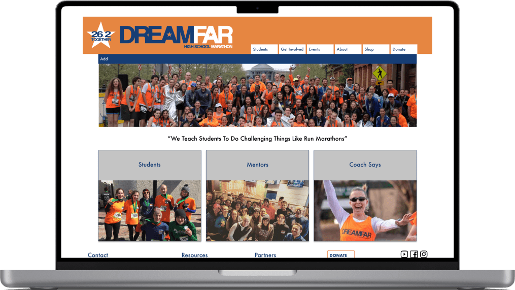
Old Homepage
New Homepage
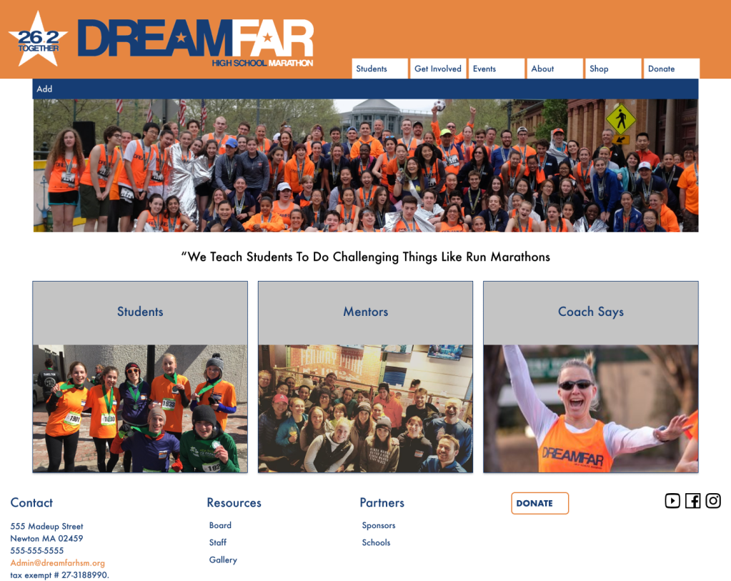
Improvements
- New page is 1/3 the size, making it easier to find the right content
- The layout pattern is more pleasant, as the pattern looks deliberate.
- No buttons. Pictures are links instead
- Feels more energetic, more fitting for a high school group of running marathons
New History Page
Old History Page
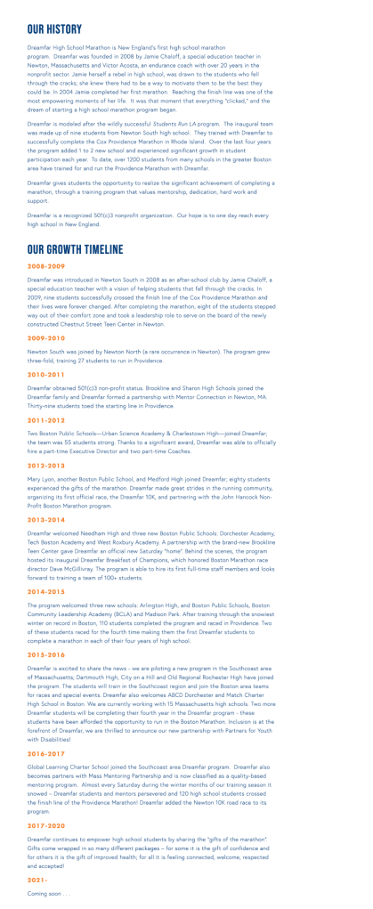
New History Page
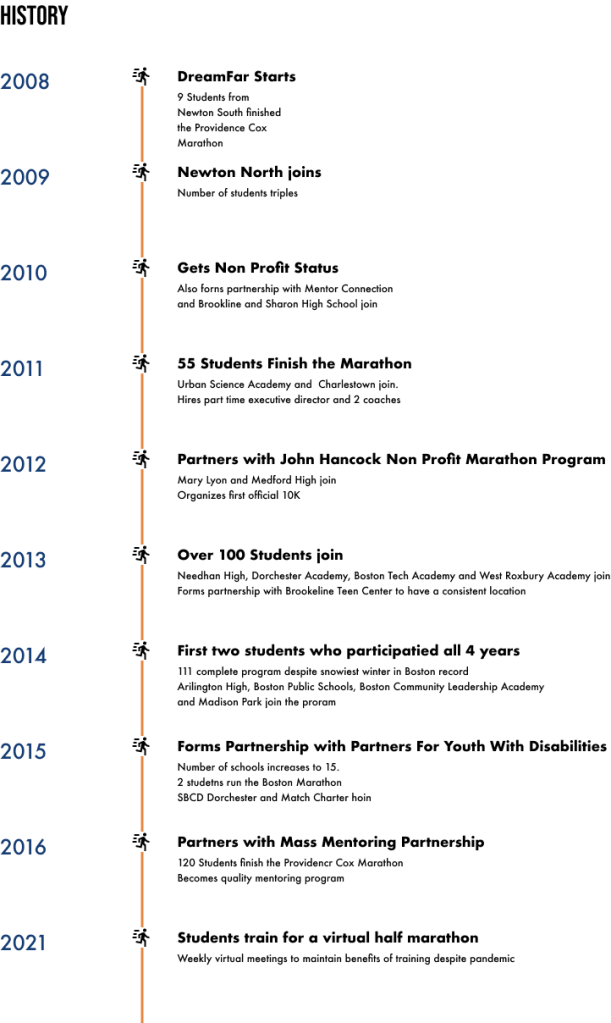
Improvements
- Removed lengths paragraphs.
- Shortened points to bullets
- Drew attention to most important accomplishment of the year
- Added a time line and a little bit of graphics to be more visually appealing
Old Mentor Page
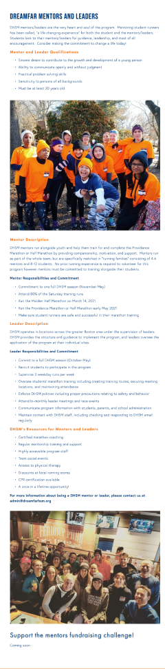
New Mentor Page
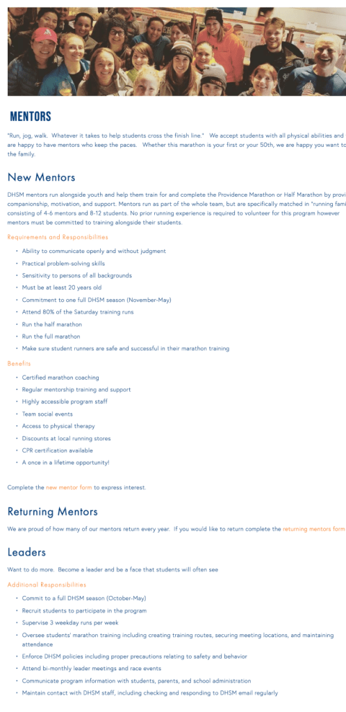
Improvements
- Ability to apply from the website rather than email the organization
- Clearer hierarchy so that a person can find their information quickly
Old Students Page
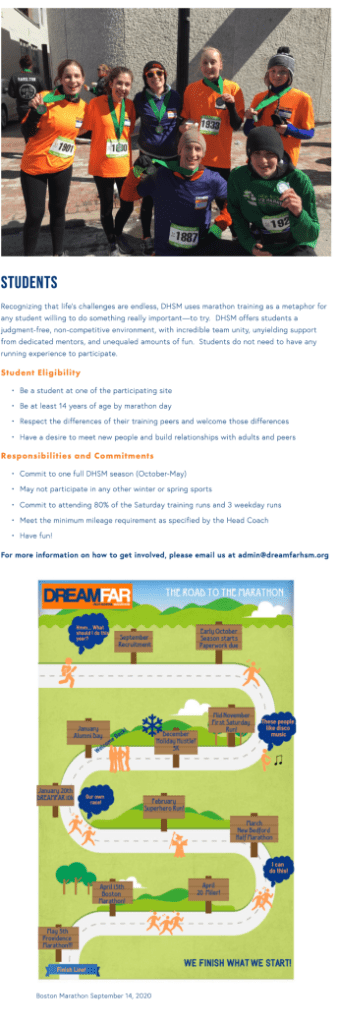
New Students Page
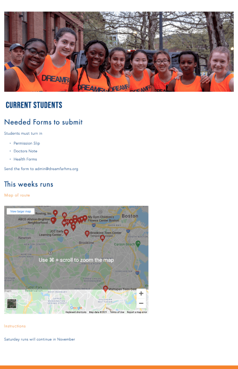
The site formally only had information for students who were thinking about joining the program. But there is a wealth of information that students need each week, and there was no place on the website to go.
Responses to the design
“The layout is so clean. The structure is clean. The site is so easy to use.”
Quote from user working with the site
“I wish there were more pictures of the students, especially through the years. It would help me see how the program progressed.”
Results
- User are more pleased with the design those who were familiar with both are happy with the new clean organized structure
- Design will be rolled out for the fall at this point, we will be able to test to what extent improvements have translated into KPIs
- Client ready for additional features the larger plan is to turn the site into a portal where students and mentors can find the information that they need for each week. This redesign gives the structure needed to make those improvements.
Lessons Learned
- An unpleasant UI can signify larger issues.
The client and every user I showed the original site to were immediately unsatisfied with the buttons as the navigation. However, the real problem was that the overall strategy was not defined. - Good communication fosters communication
When the project started it was challenging to know what COULD be done with the site. There was no strategy, and no clear use, which made it more challenging to figure out how to do user testing. Through switching buttons to pictures, and focusing on the needs of the few, people were more excited about talking strategy. - Distance from the product to know who is forgotten
When conducting usability testing with parents, I thought that they would happily look at the students page and the mentors page to decide if it was the right program for their child. I thought they would be influenced by the empty links. The empty links were forgivable, but they were highly bothered by the page for them not having any of the information they needed to decide if they wanted their child to be in the program.
