Executive Summary
Business Context: Software Integrity Group (formerly part of Synopsys) was a Gartner-recognized leader in cybersecurity tools with a product catalog formed through acquisitions. Each product was best-in-class for its category. But bundle adoption was ~30% vs. competitors’ ~70%, because products looked too dissimilar.
My Role: Only Designer for Code Dx in a 7-person cross-product UX department serving 5 products
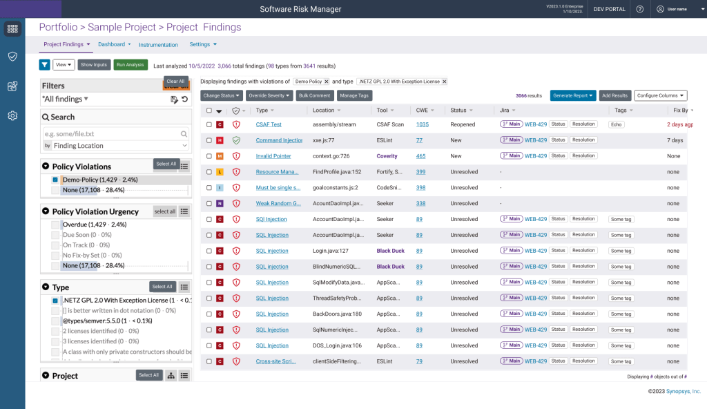
Initial Mandate: Rebrand Code Dx to Software Risk Manager, aligning visual design with Polaris (flagship cloud product).
Strategic Reframe: Improve operations to ensure that product would stay aligned.
The Constraint: I had no formal authority; I could only influence.
My Approach: Use the rebranding of Code Dx to test better way of working, use success to bring other products to encourage adoption.
Impact:
- Won Top 20 at Black Hat 2023 with redesigned Software Risk Manager that was completed 2 weeks ahead of schedule
- 33% faster delivery: 18 weeks → 12 weeks
- 80% reduction in ad hoc requests: 10/quarter → 2/quarter
- 100% voluntary adoption in 12 weeks (industry benchmark: 4-6 months with mandates)
- $13K investment secured without budget authority (5x+ ROI)
- Cultural shift: Design went from bypassed bottleneck to “small but mighty” strategic partner
- Design maturity elevation: Level 2 (Ad Hoc) → Level 4 (Structured)
Phase 1: Using Rebranding to prove better operations
Week 1 Investigate disfunctions in current operations:
To execute the rebrand successfully, I first had to investigate the current design decision-making process. I conducted a rapid assessment that included: interviews with designers, a technical review of the Sketch component library, and direct inspection of the demo environment through interaction and Google’s Developer Tools (Inspect).
This analysis quickly uncovered severe systemic problems, which was making UX into a bottleneck:
Inconsistent “Flagship”:
The alleged source of truth, Polaris, was itself inconsistent. The Polaris UX Lead admitted,
“Polaris isn’t consistent with Polaris.” Dave Staff UI Designer in Polaris
In a rush to get products out the door, PM, Developers, and Designers were each making design decisions for whatever screen they were working on.
Broken Design Library:
The Sketch component library was architecturally broken. It was incomplete, lacked component states, and forced designers to manually detach symbols to use them, guaranteeing they wouldn’t stay aligned.

Unsocialized Components:
Since designers could create wireframes in any tool they preferred, updated components were not consistently socialized, leading to redundant work and a lack of standard usage understanding.

Developer Handoff Issues.
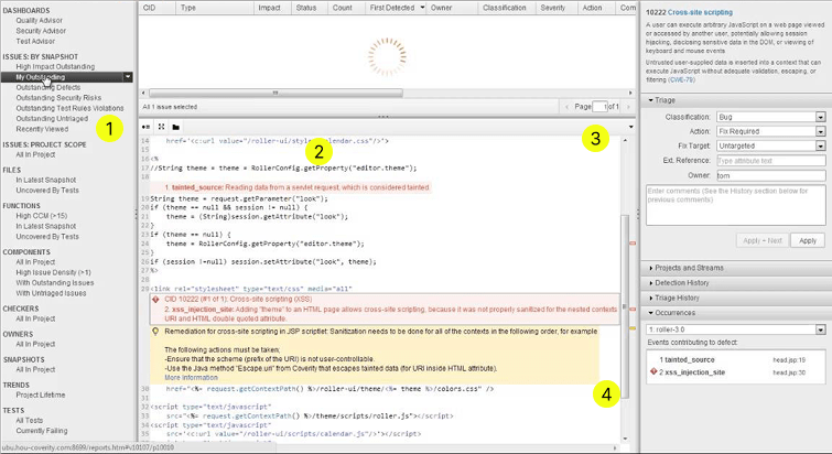
Through the deigner using a group to make sure the comments move with the wireframe, they don’t see that inspection is blocked, but the developer without edit permission can’t look past the group, and needs to make best guess to keep up with deployment.
This problem translated into icon buttons being implemented without a hover state showing the microinteraction, because the developer didn’t know it was supposed to be a button.
Uncertainty of Component State:
With neither design nor developers making use of the component library, upkeep had faded, symbols were made but no documentation on whether it was available to use, or which version to use.
“No one uses the design system anyway, so I’ve been using the Sketch file just for a brainstorming” Former Design Operations Lead
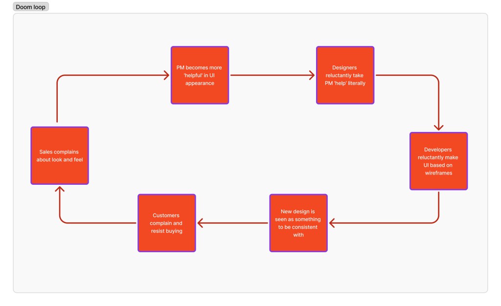
The Vicious Cycle:
This slowdown led Product Managers to attempt their own “band-aid” design solutions, accelerating inconsistency and further decreasing trust between Design, Product, and Engineering. Everyone recognized the problem but felt powerless to fix it.
I presented my manager with two steps forward for this project.
Option A: Short-term alignment. Focus only on the Code Dx rebrand, accepting that the resulting consistency would immediately degrade, guaranteeing a costly future rework (perpetual Level 2 maturity).
Option B: Strategic Clean Up. Use the Code Dx rebrand (Software Risk Manager) to clean up design operations, unify the team under a modern system (Figma), and solve the root cause continually (aiming for Level 4 Structured maturity).
My manager quickly supported my idea of using Figma and my Code Dx project to test how a better system could be made.
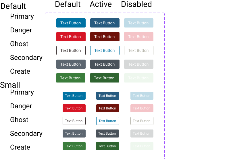
Week 2: Use Figma to create a clean slate by making 130+ components
After receiving approval for Option B, the first step was to build the foundation for the new Structured maturity model within the Code Dx rebrand (Software Risk Manager). I leveraged the project mandate to rebuild the core design assets in Figma, focusing on technical integrity and developer confidence.
Key Design System Improvements
| Area | Former State (Sketch/Ad Hoc) | New State (Figma/Structured) |
| Component Library | Architecturally broken, incomplete states. | Rebuilt 130+ components with defined structure. |
| Iconography | Generic names, unclear usage. | Provided semantic purpose for each icon, guiding correct application. |
| Design Tokens | Literal color names (e.g., Main-Calypso). | Abstracted, purpose-based token names (e.g., Blue_500 → Primary_Action→ Button_Background_Primary_Default). |
- Comprehensive Interaction States:
- States Defined: Default, Hover, Focus, Active, Disabled, and Error (where applicable)
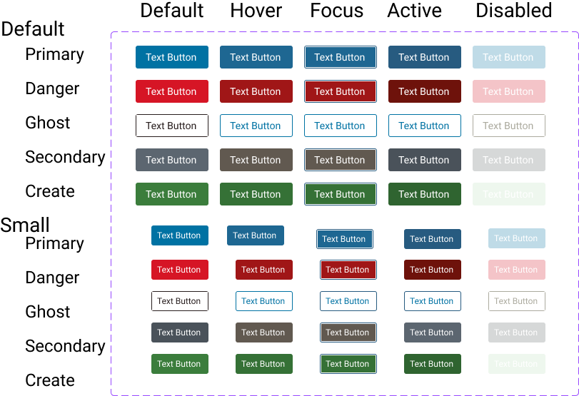
- Accessibility Specifications:
- Standards: WCAG 2.2 Level AA minimum compliance was integrated from the start.
- Documentation Included: ARIA labels defined, keyboard navigation documented, color contrast ratios calculated, screen reader behavior specified, and touch target sizing (minimum 44×44px) enforced.
Week 3: Achieving Agile Collaboration and System Validation
With the components built, I began applying these new components directly to the Software Risk Manager (SRM) rebrand. This not only advanced the project but also served as a live test case to validate how a faster, more trusting workflow could operate between Design, Product, and Engineering
Given the scale of the undertaking, I proactively shared the work-in-progress Figma file with key stakeholders and held a dedicated meeting with Product Management, the Development Manager, and the Development Lead to educate them on how to use the tool for real-time collaboration.
- Real-time Feedback Loop: Stakeholders could provide asynchronous comments directly on the designs as I worked, wihtout worrying about version
- Design Validation (SRM Complexity): Technical leads to validate the SRM design’s functional completeness and immediately flag areas needing additional design work, ensuring product integrity. Code DX had many hidden features, that were easy to miss.
The shift to a single source of truth in Figma instantly improved cross-functional relationships:
Development Lead: “I love how easy this is to communicate, and know I’m doing so on the most current version.”
Product Manager: “I love how much easier it is to show concepts to users.”
Week 6: I finished the redesign in half the expected time, proving the system’s success.
This outcome (8 weeks estimated → 6 weeks delivered, with two on setting up my space) provided the compelling evidence needed to push for broader team adoption and solidified that the new structured workflow significantly accelerated delivery.

Phase 2: Driving Voluntary Adoption and Scaling Success
The conclusive success of the Software Risk Manager (SRM) rebrand provided the necessary business justification and social proof to scale the transformation. My manager leveraged my sucess to secure the necessary Figma licenses for the entire UX team.
I Trained The Entire Team to Ensure Successful Figma Adoption
My goal was to prevent designers from simply using Figma “as if it were Sketch” and let them comfortably use features like Auto Layout and Variants to see why this change was beneficial to them..
- Training Schedule: I instituted six weeks of voluntary, hourly training sessions held every Friday to systematically introduce the new tool and workflow.
- Support Prioritization: I also prioritized answering all questions promptly, fostering a supportive environment that reduced friction during the transition.
This strategic, well-structured training program led to rapid and genuine buy-in:
Designer Feedback: “At first I hated how Figma did things, but after the explanation I realized it was how I wish Sketch would have worked.”
Within 12 weeks there was 100% voluntary adoption in 12 weeks, with all being happy abotu the change of tools
I Persuaded The Team to Use Design System Not Just Figma
I believed that a full-functioning Component Library was all they needed to design for speed and consistency. I didn’t account for deciding just to use the tools. Through reviewing work, I noticed deviations and new patterns. So I talked with the deisgners and found two problems.
Persona 1: The Stakeholder Follower
Background: Has been with the company for a while through transitions, and has learn the benefit of just following.
Fear: Being seen as non-collaborative
Needs: Clear instructions and support in saying no
Will: Make ad hoc components to please Product Managers and Developers
Solution: I supported this persona by providing more documentation and standards. I also became the face of the resistance, so this persona’s relationships stayed unchallenged.
Persona 2: The Pattern Explorer
Background: New to design, but not tech
Fear: If the design is not aesthetic enough, it will show lack of competence
Need: To look good and knowledgeable designer
Will: Do competitive analysis to see how others have used components and then push a new component design or behavior. The assumption is that if a competitor made a design, then it must be good.
Solution: Appeal to their technological background, to discuss the impact of new component designs and the cost of making new components. Explain what challenges the new designs had and discuss alternatives.
I convinced the team to change the focus from visual consistency with old to quality and strategy.
To handle the concerns of the designers, I implemented a few strategies.
Implementing Critical Governance Frameworks
I established two key initiatives to institutionalize design rigor and knowledge:
Weekly Design Critiques
- These discussions would focus on technical constraints and optimization instead of subjective opinions.
Designer Feedback on Mentorship: “I was always happy to ask you for feedback on my work because I knew that you would be truthful about any shortcomings in my designs and that you would work with me in a way to improve upon them.”
Designer Feedback on Teaching: “You have this amazing ability to teach complex topics but break them down for a layperson. On top of being knowledgeable, you do so in a way that never made me feel rushed or judged. I knew I could ask you anything.”
Accessibility Workshops:
- Business Mandate: Given the product’s market (governments and EU countries), meeting accessibility regulations (WCAG) was a critical business requirement.
- Knowledge Transfer: I conducted targeted workshops on complex accessibility topics, ensuring the team was equipped to meet compliance standards without external intervention.
Cultural Impact and Strategic Empowerment
This combination of structured critique and education not only improved output but also fundamentally redefined the role and authority of the design team:
- Breaking Design Silos: The weekly critique sessions successfully broke down design silos, moving the team from designers only knowing about their own product work to talking as a unified team and sharing knowledge across the entire product portfolio.
- Strategic Seat at the Table: The team gained a stronger influence on product strategy, culminating in successfully pushing back against the Polaris Head of Product Management to champion a more robust, user-centered UX strategy across the portfolio.
- Mentorship and Trust: The supportive governance fostered a high-trust environment, reinforcing the strategic value of the new leadership model.
Phase 3 Company Investment
At this point, we had established a single source of truth for Design (Figma), but true build consistency required a unified reference point for Developers and Designers to communicate. Given that each product had its own codebase (Ember, React, or Angular) and unique communication methods, we needed a common documentation platform to enforce the new system standards and fully achieve Level 4 maturity.
We first attempted using the existing Confluence instance, but rapidly determined its architecture was unsuitable for design assets. Because our designers primarily navigate visually, not alphabetically by name, displaying components efficiently was impossible; documenting every state would have required a separate page per element (e.g., 50 individual icon pages). This non-scalable structure would have created excessive cognitive load and performance latency, proving the necessity of a dedicated, optimized system. My manager and I reviewed solutions and selected ZeroHeight.
I worked with my manager to create 3 pitches to secure ZeroHeight
We formulated three distinct pitches to leadership, centered on quantifying the operational savings:
- Problem: Frequent back and forth on ad hoc components, which necessarily reduces WCAG compliance
- Time Cost Calculation: Based on average returns for a design system and the size of teams, we calculated this represented 3,000 Designer hours and 3,000 Developer hours saved per year. So cost $13,000 to save ~$600,000
- Value Proposition: Zeroheight would eliminate this waste, freeing up high-value design time and reducing developer stalls, proving that future ad-hoc requests would be rare.
The pitch also highlighted the critical future value of the documentation platform:
- Maintenance: Reducing future maintenance overhead and risk as the system evolves.
- Code Unification: Providing a common baseline to guide development teams toward eventual codebase unification.
Result:
The investment justification, framed in terms of calculated time savings and risk reduction, was approved, securing the $13K for Zeroheight after the third pitch.
I Created Guidelines For How to Request New Components.
When Product or Engineering requested custom component, designers followed decision tree I established (with organizational backing):
The process:
1. First response: Assess current inventory of components to see if there is a fit
2. If genuinely new: Evaluate against framework
Designers had clear, documented criteria:
- Is it generalizable? Does it solve a problem beyond this one use case?
- Does it solve a real problem existing components don’t address?
- Is the ROI worth the maintenance cost? Will we maintain 5 versions of this component across products?
3a. If approved: We add to system with documentation
3b. If declined: Designer advocates for existing pattern, with design leadership backing if needed
The transformation:
Designers went from reflexively saying “yes” (appeasement) to being strategic in when to build new components and Ad hoc requests dropped 80%.
Impact
Performance Transformation
- 33% faster delivery: 18 weeks → 12 weeks
- 130+ WCAG 2.2-compliant components fully represented
- 80% reduction in ad hoc component request
- 100% voluntary adoption in 12 weeks
Business Impact
- $13,000 ZeroHeight investment with 5x+ ROI
- Unified design language enabled bundled product positioning
- Consolidated tool licensing cost
- Improved cross-functional collaboration
Design Maturity Elevation (2 to 4)
- Formal Process
- Documented Standards
- Strategic Influence
- Systematic Quality
- Effective Governance
- Shifted organizational culture
Lessons Learned
- You can’t dictate using design systems, you need to persuade.
- Opening doors for success doesn’t mean people feel safe to walk through them.
- Change management is more important than component quality
- When securing new tools be ready to justify numbers; even small investments must be justified.
- Broken infrastructure creates interpersonal conflict. Look past the personal issues to fix system and that will repair relationships.
- Design maturity elevation requires coordinated capability building.
Appendix: Technical Decisions
Why Figma instead of Sketch?
Figma advantages for our context:
- Collaboration: Multiple designers work simultaneously (vs. Sketch file conflicts)
- Confidence: Designers and developers knew they were looking at current version (no “which file is latest?” questions)
- Quick edits: Ability to update projects during developer meetings increased iteration speed
- Version control: Built-in version history (vs. manual Sketch file versioning)
- Developer handoff: Inspect mode provides CSS directly (vs. Sketch Measure plugin)
- Component architecture: Variants system more powerful than Sketch symbols—specifically solved checkbox spacing problem through auto-layout
- My persuasion advantage: I had deeper Figma knowledge, enabling faster demonstration of benefits
Trade-offs accepted:
- Team relearning curve (mitigated through comprehensive training program)
- License cost (offset by eliminating other tools + efficiency gains)
Why this choice succeeded without mandate: I proved through Code Dx pilot that Figma solved specific Sketch frustrations before asking for broader adoption. Demonstration beat declaration.
Why ZeroHeight instead of Confluence or internal wiki?
ZeroHeight advantages:
- Figma integration: Live-linked components update automatically (always current)
- Design-focused: Built for component documentation (vs. general wiki)
- Developer-friendly: Clean interface, good search, clear specifications
- Version control: Can see historical versions of components
- Professional appearance: Demonstrated design maturity to enterprise customers
- Code-base flexibility: Worked with React, Ember, and Angular (our three frameworks)
- Solved Sketch problem: External platform meant documentation never blocks Inspect mode
Alternative considered: Building custom documentation site
Why we rejected: Would require engineering resources better spent on product features
ROI calculation that persuaded executives: $13K ZeroHeight investment < cost of engineering time to build equivalent (and ongoing maintenance)
Why this choice succeeded without budget authority: Built business case in executive language (ROI, risk mitigation, competitive positioning), pitched multiple times with different angles, brought developer testimonials proving pain was real.
Why semantic color tokens instead of literal names?
Problem with literal names (e.g., “Main-Calypso”):
- Designers don’t know when to use it (Is it for buttons? backgrounds? text?)
- Developers hard-code hex values because token names are unclear
- Can’t change color without breaking semantic meaning
- Created confusion that contributed to “which blue?” problem during handoffs
Benefit of semantic names (e.g., “Primary-Background-Interactive”):
- Clear usage intent (this color is for interactive elements)
- Can change underlying color value without breaking usage pattern
- Enables theming and future dark mode support
- Prevents misuse that creates accessibility violations
- Eliminates handoff questions about “which blue to use”
Example transformation:
Old TokenNew TokenUsage ContextMain-Calypso#275B80Primary-Background-Interactive / Blue-500Interactive elements (buttons, links)Main-White#FFFFFFPrimary-Background / WhitePage backgroundsMain-Whisper#ECECF1Secondary-Background / Grey-500Secondary backgrounds, disabled states
This naming strategy directly addressed one of the handoff pain points—developers no longer had to ask “which blue?” because token name communicated intent.
Why this succeeded without mandate: Made doing the right thing (using correct semantic token) easier than doing wrong thing (guessing at hex values). Self-reinforcing through clarity.
 Phoenix Ehmann Product and Service Designer