Summary
Business Context
Polaris is Black Duck’s cloud-native Software Risk Analysis (SRA) platform. It integrates multi-factor security scanning into a unified DevOps interface, enabling organizations to manage vulnerabilities in open-source and proprietary code at scale.
Project Nature & Scope
Role: Lead Product Designer & AI-Enhanced Workflow Strategist
Status: Self-Initiated Exploration | Independent Product Vision
This project was a self-directed exploration of the Polaris triage workflow. It is not an official corporate initiative but serves as a design vision demonstrating workflow improvement opportunities.
Methodology
I combined traditional UX research and design practices with AI-augmented simulation to accelerate the design-to-validation cycle.
The Problem
Security analysts experience chronic “triage fatigue” due to a high volume of low-signal vulnerability alerts. Manual cross-referencing increases cognitive load and slows Mean Time to Triage (MTTT), reducing overall team efficiency.
Projected Impact
AI-simulated outcomes suggest the following improvements:
| Metric | Target Outcome | Driver |
|---|---|---|
| Mean Time to Triage (MTTT) | 50% reduction | Shift from manual search to Intent-Based Filtering |
| Operational Overhead | 70% fewer status meetings | Bi-directional Jira sync & AI-summarized comment threads |
| Resource Allocation | 80% triage automation | AI-suggested actions enable junior analysts to handle routine tasks |
Research
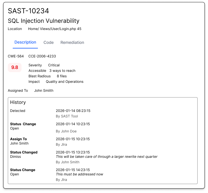
Using a mix of statements of from customers and customers as well as running the image through Claude, I found several flaws in the current iteration.
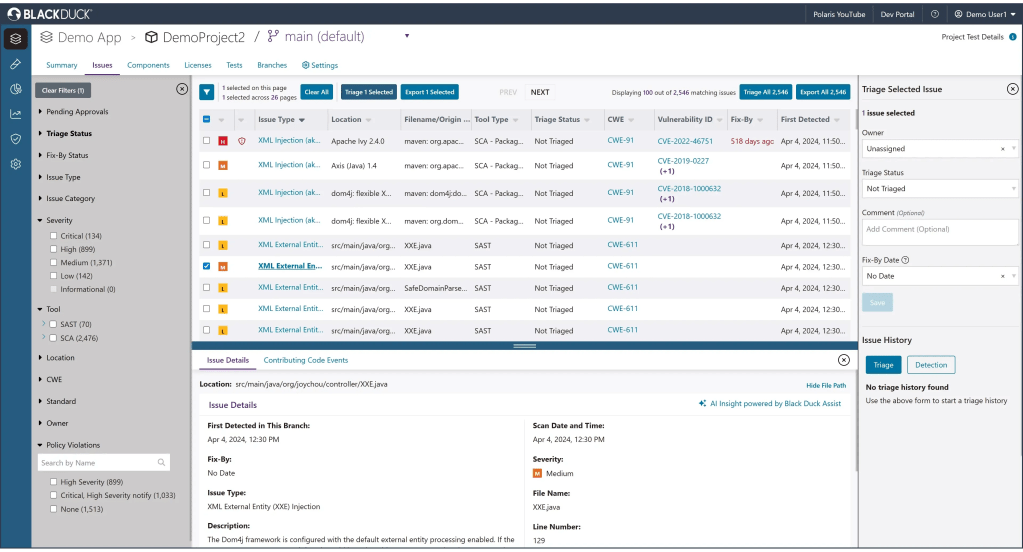
- Difficulty tracking issues through all touchpoints because there is no issue ID
- Uncertainty regarding how to prioritize, because severity doesn’t tell a full story
- No SLA anywhere
- Both too much and not enough information
- Unclear icons and at wrong level of hierachy
- Lots of information too truncated to be readable
- Can’t add new columns
- Lots of redundancy
From here I looked into the different workflows
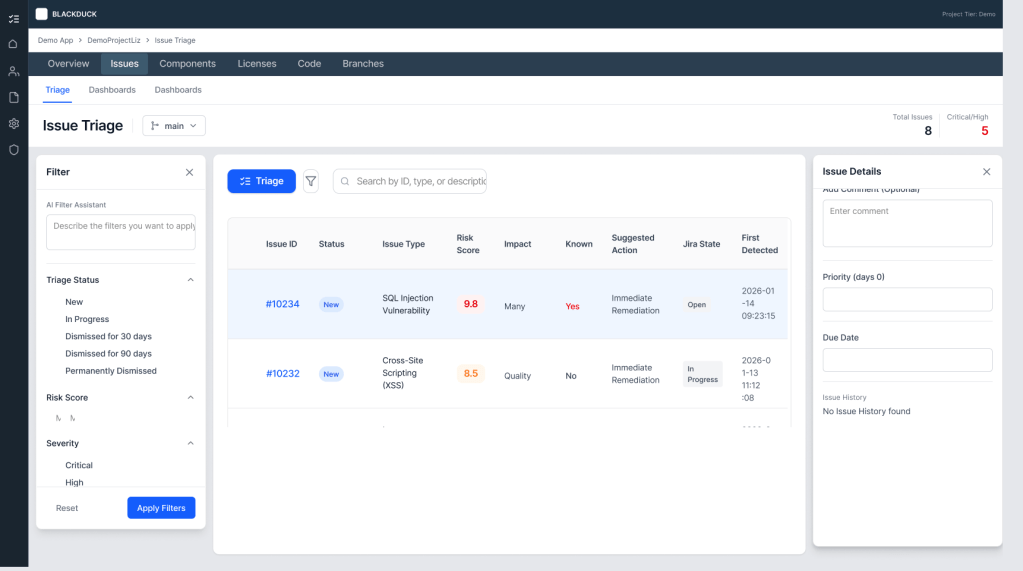
It became clear that there need to be more separation of concerns, but I wanted to keep a similar format, so I used Figma Make to make updates to the table.
Design
First Attempts
My goal was to create different sections each with their own purpose.
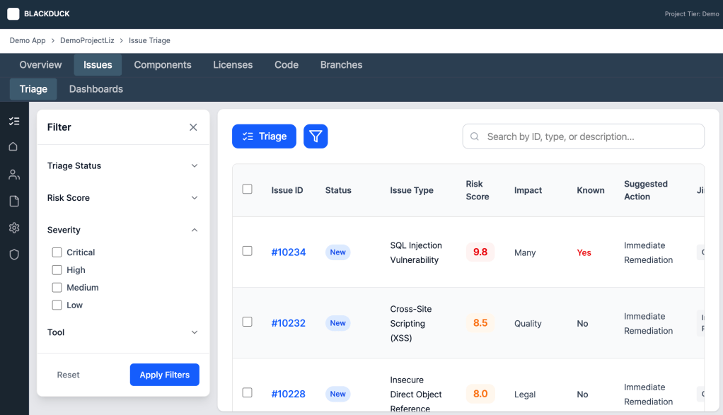
- The table would be a list of issues to see which issues required actions and at what priority. It could also show when an action was stalled at a point
- Drill down modal would expand on ideas, allowing the table to be minimalistic and readable
- There would be a new page for dashboards for high level investigation
- The Filter would provide a way to recognize patterns on a more granular level
This approach would involve using more AI. An analyst could create their list of issues to review through a request. “Show which area has the largest concentration of risk.” Also now the tool would be analyzing the risk involved with an issue, which would prioritize a high-severity issue that was easy to access over a critical issue that hackers couldn’t reach online.
I created my design for the filter through prompts
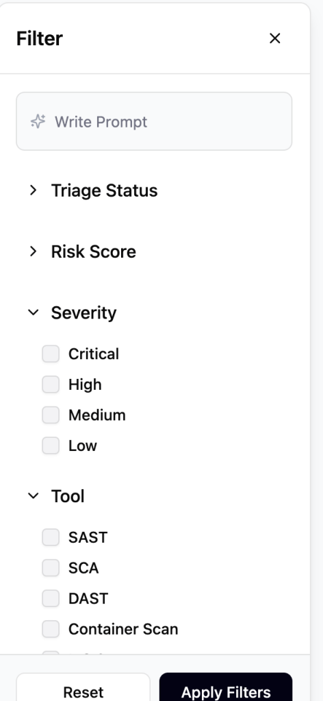
This was considerable faster than manually designing and was highly accurate. However it did not translate as well when I tried to create a page using the filter; it initiially reduced options, wasn’t scrollable, and also made using the table impossible, because it wasn’t scrollable.
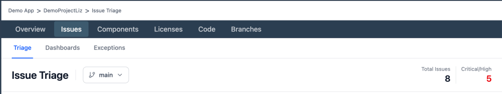
However, it revealed that there were challenges in the initial layout. It translated the combination H1 and breadcrumb into just a breadcrumb. It removed the functionality of being able to change branch, because it wasn’t clear what the dropdown was doing. I would need to manually resolve this, as well define the tertiary nav in a way to not have the same weight as the seconday nav.
The way it chose to display the information in the dropdown, also needed improvement. Proximity of content, didn’t show the right grouping that was needed.
I updated both manually, focusing more on layout and not as much on polish. My assumption was that if my visual was clear enough, AI could fix the details.
Not only did it work, but by giving expected layout, I could also get other need ed layouts.
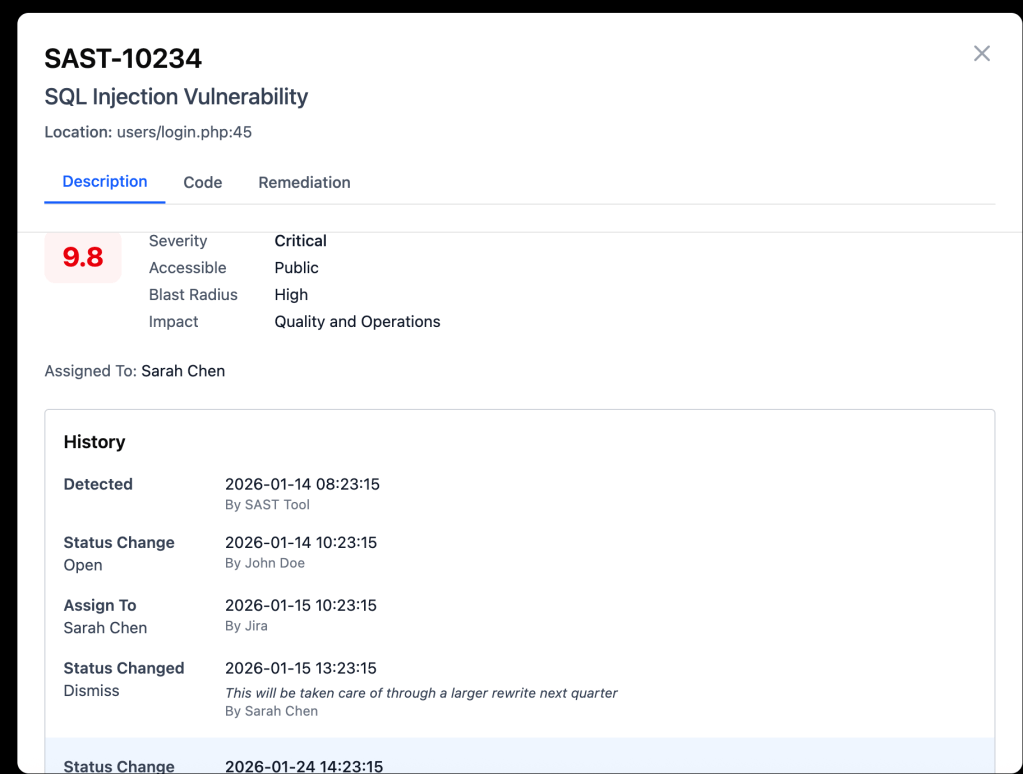
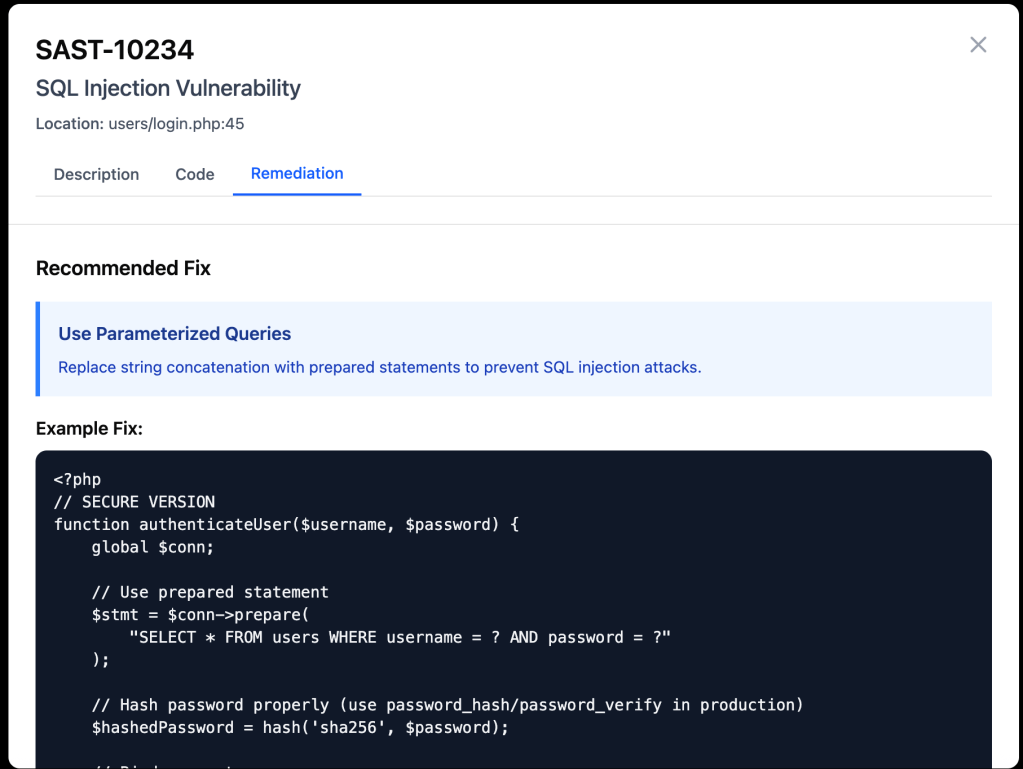
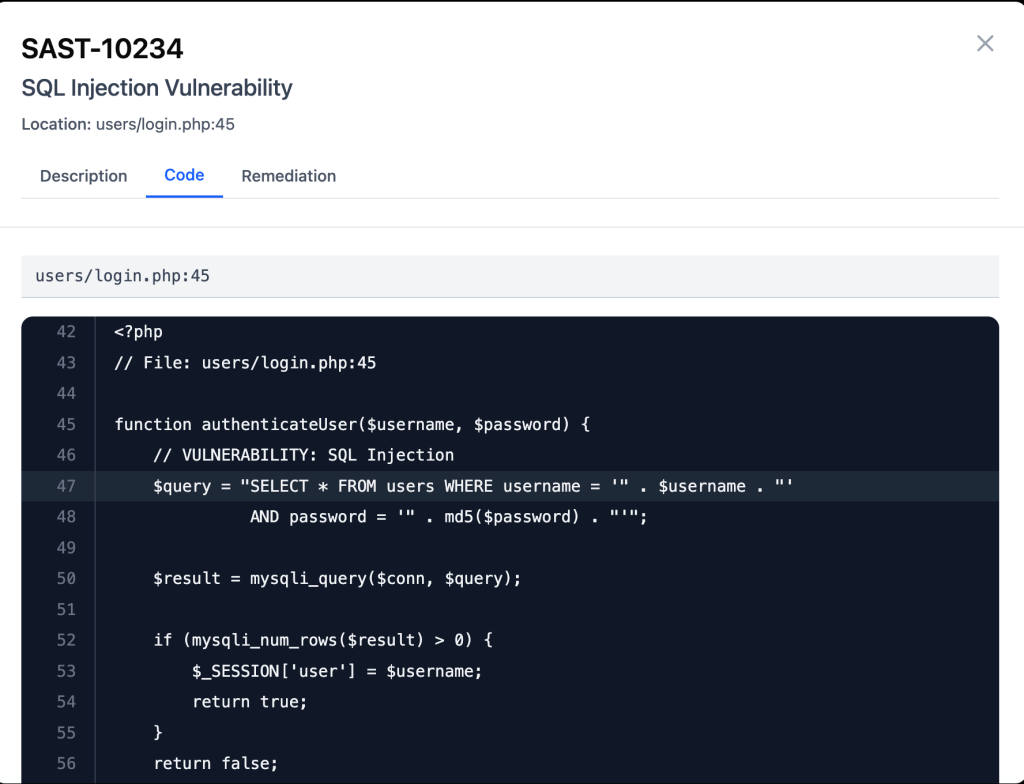
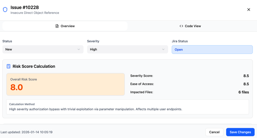
After the layout was set, because I didn’t have access to security analysts, I used AI to test whether this would lead to improvements or not. This revealed that I have had put in details about risk that aren’t as needed and missed compliance, which is SLA date. While SLA was also not in the original, that is a key to prioritization.
I iterated on the design.

And then I tested again to find this made the needed changes.
I then defined the managers experience and the auditors.

Results
| Metric | Target Outcome | Driver |
|---|---|---|
| Mean Time to Triage (MTTT) | 50% reduction | Shift from manual search to Intent-Based Filtering |
| Operational Overhead | 70% fewer status meetings | Bi-directional Jira sync & AI-summarized comment threads |
| Resource Allocation | 80% triage automation | AI-suggested actions enable junior analysts to handle routine tasks |
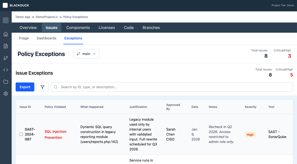
- Better Jira Intergration
- Transparency of when commments were laid allows for communication in system, instead of needing to discovery comments later by chance
- Separated Fixed Date and SLA, to facilitate better communication between the manager and analyst.
- Better communication regarding dismissed to preserve safety later.
Lessons Learned
- AI will get one most of the way, but it needs to be finished by human, because designs should have features that differentiate
- While prompts can iterate on a design, fixing issues requires working like an engineer
- AI-augmented testing is an excellent “smoke test” for logic, but requires a human SME to catch industry-specific nuances.
- When getting to focused on a path, let AI challenge thinking in a new context
- Know when accelartion is need and valuable vs precision
