
How To Transform Brick And Mortar Into Web
Some retailers build shopping experiences based on people coming to the physical store.  There is an element that shoppers love that can't transfer to a website.  It could be the physical location, environmental aspects, or just an extraordinary staff member.  They didn't develop a web strategy because they based their successful business strategy on in-person shopping.
When the Coronavirus pandemic started, retailers needed to pivot quickly to build a web presence.  They did, but quick builds require improvements
Eso Won Bookstores is one of these examples.  It is a bookstore loved and supported in the local environment.  It has been around for years. It is a trustworthy source for non-fiction books, especially about race relations.  But they didn’t build a website until the pandemic.
In this two-week concept project, I worked alone to analyze the website and design improvements.
The Problem
Hard to find a good book
Can’t filter by genres. Confusing search bar. Can’t scan book display pages. Buying a book was no easy task.
The Hypothesis
Increase accessibility increase sales
- Make search results clearer and more accurate to make it easier to find a good book
- Build function to filter by genres to make browsing books possible
- Build function to have reviews to allow for evaluation
My Role
I worked on this project alone but pooled some resources with other designers to enable card sorting and a heuristic evaluation.

Methods
Desk analysis, Competitive and Comparative Analysis, Information Architecture Redesign, Navigation Redesign,  Wireframes, Prototyping, User Testing
Desk Analysis
Great store challenged website
I began the project by conducting a desk analysis to learn what makes this bookstore stand out.
- Eso Won is known for a great selection of nonfiction books
- The stores was built as a response to schools failing BIPOC
- People have complained about not getting the books when ordering online
Information Missing, Inaccurate, or Hidden
Knowing that the concept is a place for educating in ways that schools are failing, I conducted a LEMErS Heuristic Evaluation with 5 other designers. My goal was to find what areas were most needed to improve the site.
Needs improvement in Learnability and Memorability
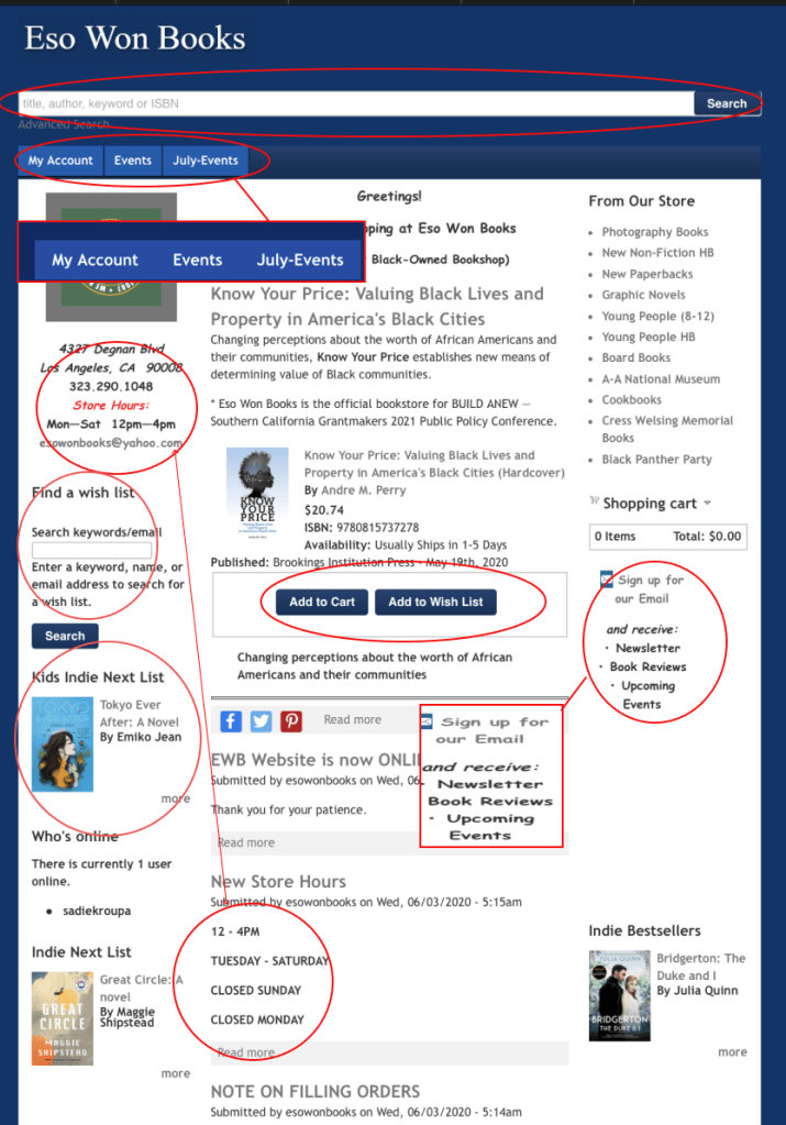
- Search Bar Was Hard To Find (Learnability)
- Navigation Tabs not relevant (Efficiency)
- Hours inconsistent (Errors)
- Find a wish list is a new function (Learnability)
- Kids Indie Next List book changes on refresh (Memorability)
- No Hierarchical difference in CTA (Learnability)
- Does not show links (Learnability)
Search bar was hard to find. Advanced Search harder. And results were erroneous.
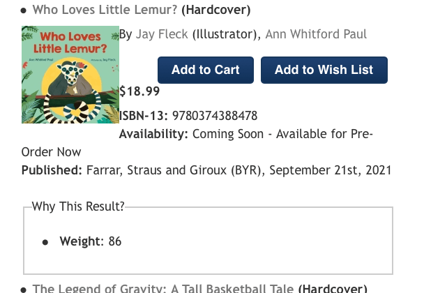
An illustrated kids book is 86 lbs!! (errors)
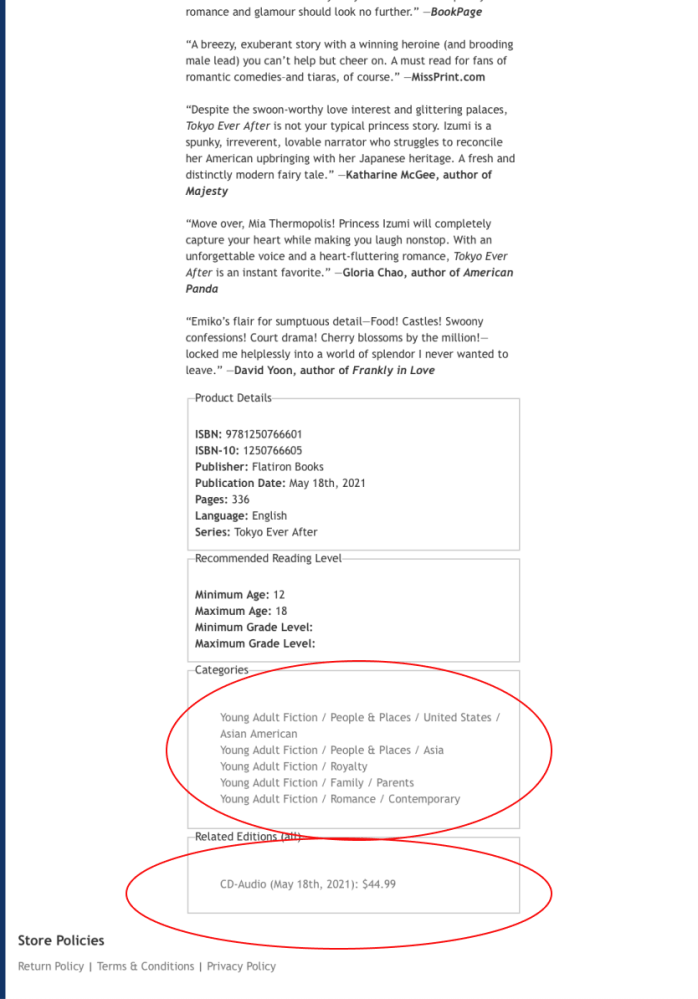
- Clicking on category has a function. (Learnability)
- Can browse books by categories from this page (Efficiency)
- Other editions are located at the bottom of the page. (Memorability)
- No customer or store reviews available on the page (Satisfaction)
System Doesn’t Match Reality
Through conducting the heuristic analysis and talking to people who worked at bookstores, I learned how task flows for the site did not match expected behavior.
Desired path not available
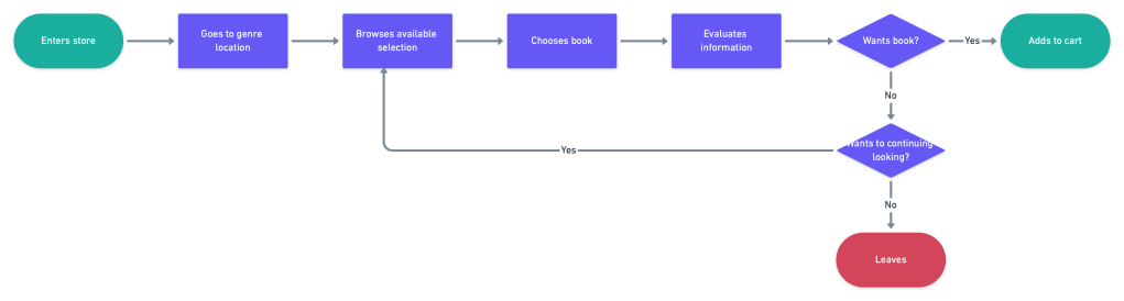
Whether in person or on the web, a shopper wants to browse by genre. It is an expected and common behavior of people shopping at bookstores.
Current path to browse books
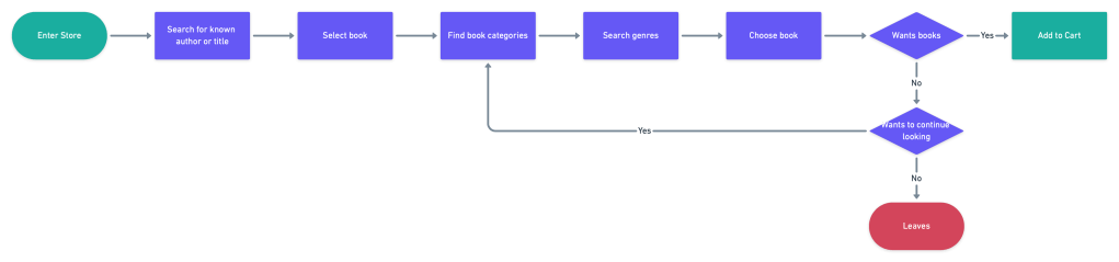
Shopper on website needs to look for a known book title to begin a search. Title not always known. Browsing not always possible.
Requiring dummy data has crap results

To enter an an expected book into the database, false information is required. With this requirement and no filter, obviously false results are returned.
‘Find A Wishlist’ lost books
I tested the Find A Wishlist function by having a friend place a book on her wishlist and I bought it.
| Placed Book on Wish List | Bought Book from Wishlist | Wishlist fulfilled | Book Goes |
| California Friend | Me in MA | California Friend | Tested |
I received in quick time, but was not expecting it.
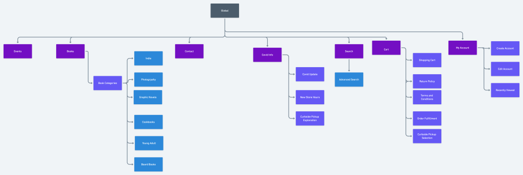
Too crowded for needed features
A genre filter was needed on the home page. But where? The search bar needed to be easier to find. But how? I created a site map to understand the architecture and begin to ideate on where it could be placed.
Making Space is in the Cards
In an effort to declutter, I conducted a card sort. 13 people were recruited. I wanted to better understand how people grouped information.
In particular I wanted to know:
Are staff favorites viewed as books or part of store identity?
Where would people want information about curbside pick up?
What we found was
- Staff favorites are group with books not store information
- Curbside pickup is considered part of policies not orders
- About information is group together
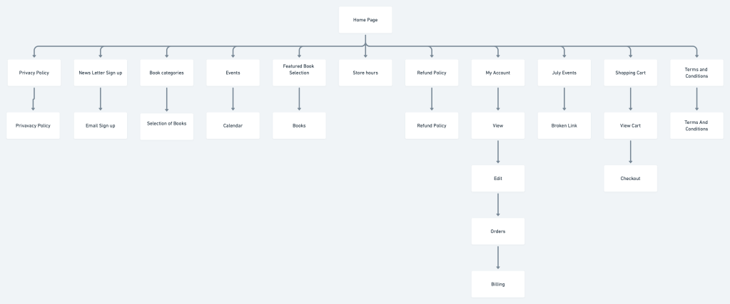
With this information, I created a new site map
How Do Filters Look on Homepages?
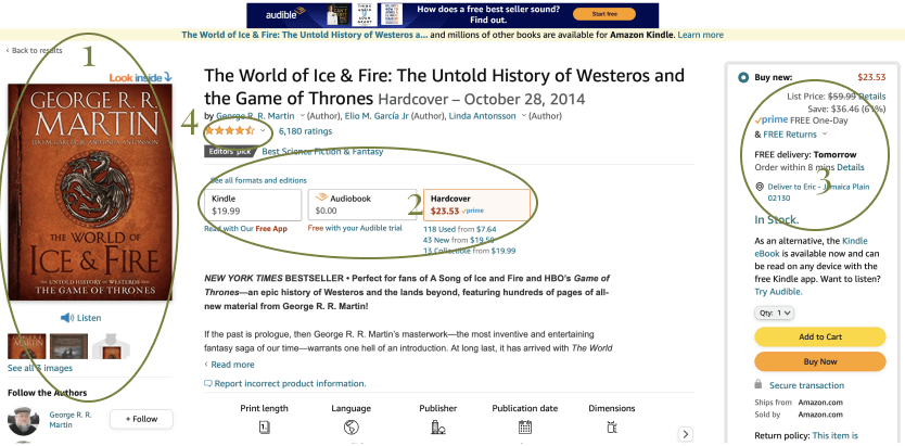
Having a sense of where to place the filter, I looked at competitors for what it should look like. I looked At Barnes and Noble, Amazon and GameStop for inspiration
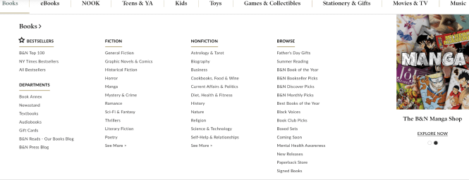
- Large area for writing genres
- Prominent content at the top
- Can have filters on the side
- Normally text based
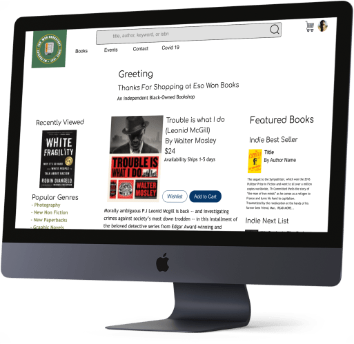
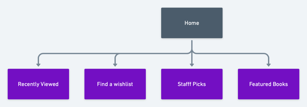
New Improved Homepage
Introduces Genre Based Searches
Now that there was a genre filter and the search bar was easier to find on the homepage, it was time to look at how to improve search results.
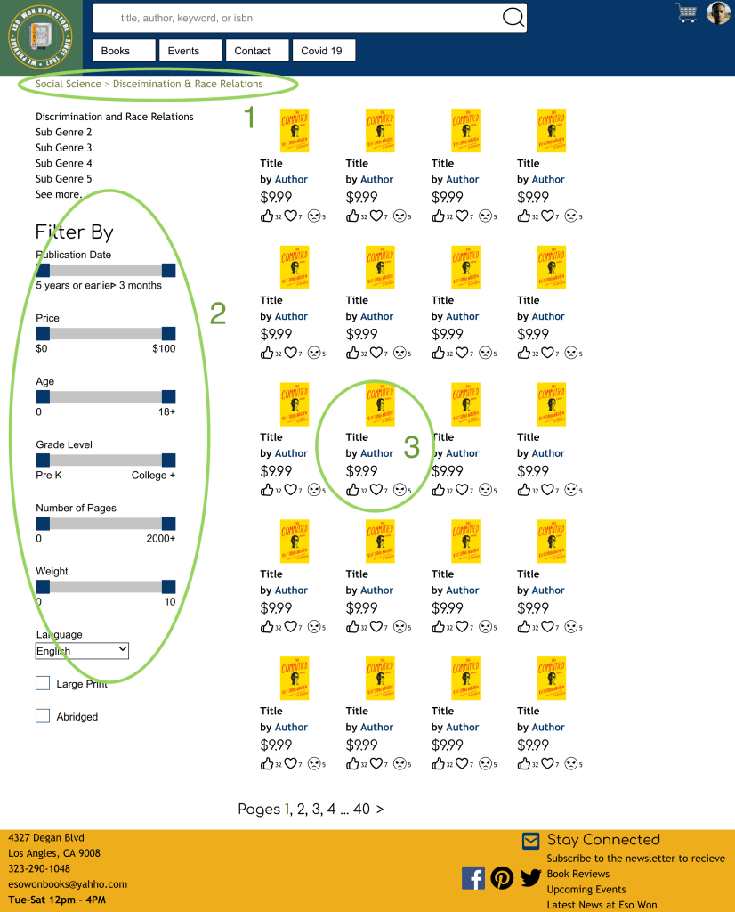
Search Page Features
- Breadcrumbs navigation to help with looking through categories
- Advanced search switch to a sidebar filter. The weight category can’t go above 10 to not show fake data.
- Books search results with ratings. Used icons instead of stars because Eso Won already had a strong social media presence
What’s In A Product Display Page
Now that customers can more easily find books, I needed to make the display page easier to use. I did a competitive analysis, looking at Amazon, GameStop and Barnes and Noble . And found a consistent pattern
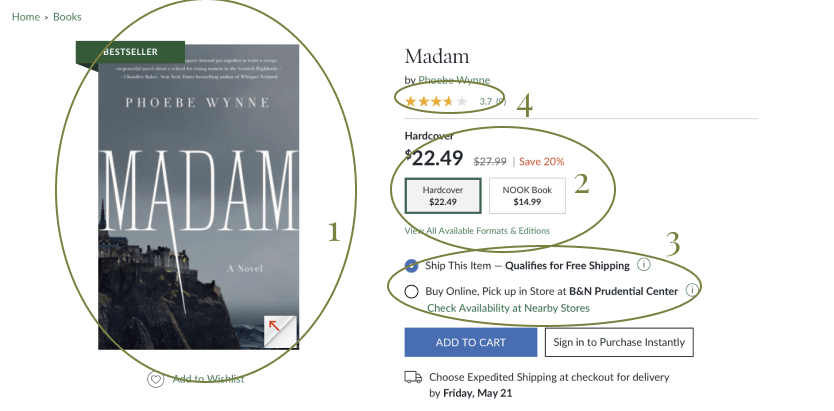
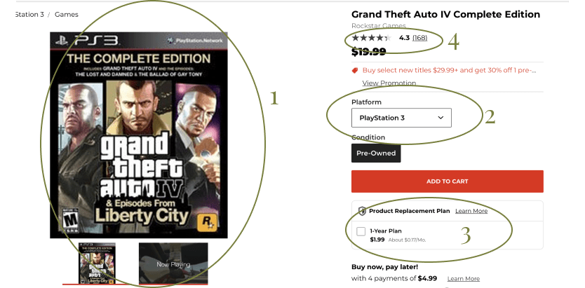
- Chosen item has a large photo
- Easy Ability to change editions
- Shopping decisions beyond just product
- Customers can leave reviews
Eso Won offered none of these features. So I added some more features to the page
.
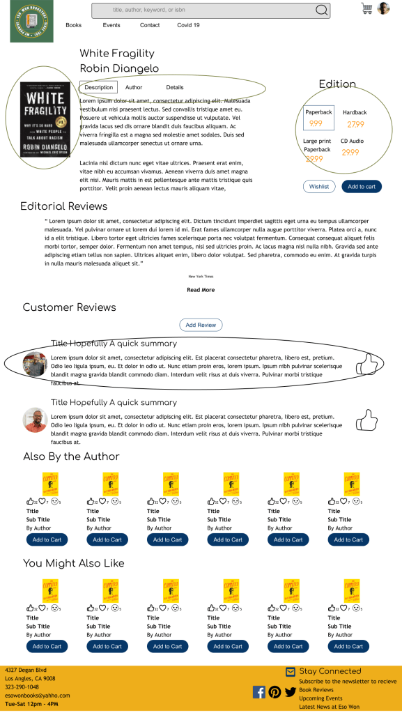
- Tabs for different sections of content reduces scrolling as a search method
- Big display of book that could be purchased
- Choice of Editions
- Ability for people to write reviews, with the owner’s review being first as he garnered trust
What do the critics say?
I conducted 4 rounds of user testing. For availability, I used 4 white people in the New England area. This was to test if my redesign made a sort of sense.
4/4 Users were able to find a book. This is because familiar components were now included in finding a book.
4/4 Users were able to write a book review but commented that they wanted to be able to include the review in other sources, such as Facebook. Adding this feature could be aligned to Eso Won Bookstore strategy.
0/4 Were able to see the Recently Viewed Books, showing it needs to be relocated
0/4 users looked at the description of the book to find similar topics. This navigation was carried over from the old site, but tests confirm that it is not a common navigation pattern.
Lessons Learned
Research more when making design decisions. While each page had improvements, it could be expanded even further through investing more time in each component.
Test with the audience This is a bookstore that connects to the community, as such if possible testing should be done with African Americans in LA to keep it as their bookstore.
Conduct more Comparative and Competitive analysis when designing features. Many great ideas have already been done, it’s just a matter of analyzing the benefits of what has come before to find the best fit
